User Experience & Interface Design
With a visual and publication design background, I have consistently prioritized considering how my audience will interact with my designs. From understanding the cultural context of my audience to effectively guiding their attention using principles of hierarchy and Gestalt theory, I have approached my designs with a functional mindset, whether in print or digital formats. This attention to the overall experience has also translated into my work in the gaming industry. While games present unique considerations for user interactions and user experience (UX), the following project specifically highlights my exploration of menu design and functionality within the realm of UX with a “design thinking” approach.
Interactive & Digital Design
SIUE Marketing and UX Strategy
At SIUE, I have been responsible for creating visual and interactive content for various digital media platforms. From User experience and Web Design to motion graphics and Digital Style Guidelines, I have handled all aspects of digital marketing strategy.

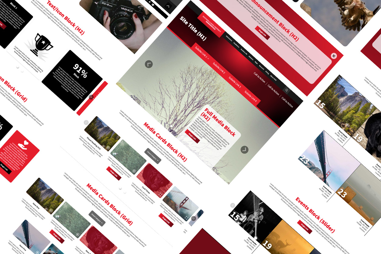
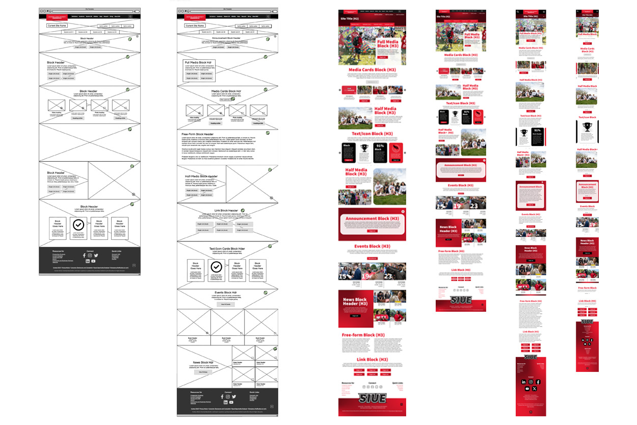
Cascade Template Development
UX/UI Design and QA of a New Template System for the University Website
As Lead Designer, I spearheaded a ground-up overhaul of SIUE’s legacy Cascade CMS, transforming antiquated infrastructure into a high-performance, WCAG 2.1 AA compliant modular ecosystem. By engineering a comprehensive library of “Universal Blocks” and establishing new Institutional Digital Guidelines, I bridged the gap between strategic branding goals and technical execution.
This architecture didn’t just refresh the university’s visual identity; it served as a catalyst for measurable growth—expanding the digital ecosystem to double advertising leads and drive a 600% increase in email engagement. This system now provides the governance and scalability required for the university’s ongoing digital transformation.
Check out my Cascade Design case study here.
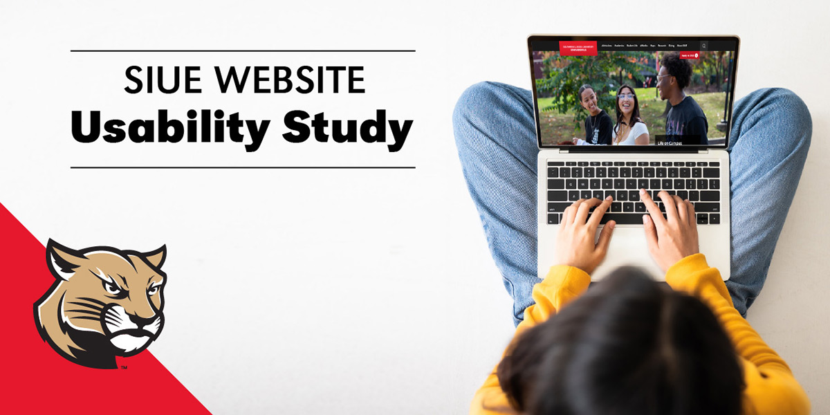
University Website Usability Study:
Forging Design on Data
Large-scale research study on the academic website
To transition SIUE toward a user-first digital ecosystem, I launched a comprehensive usability study. By leveraging my IRB Social Behavioral Certification, I established a research framework that reached 748 participants, transforming anecdotal feedback into a strategic roadmap for the university’s future development. I utilized the AI research System, NotebookLM, to process this large data set to present to my team.
Check out my Usability Research case study here
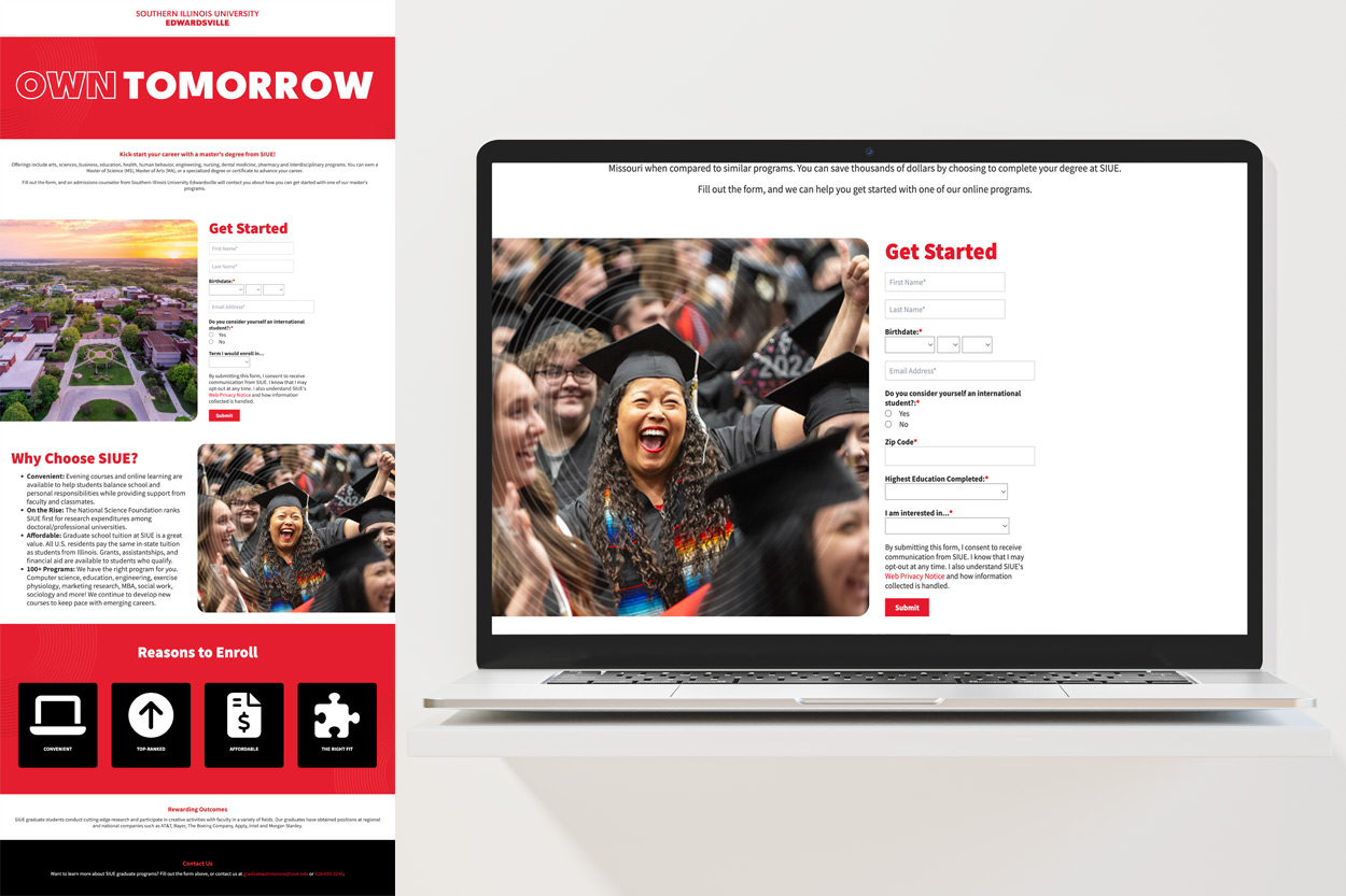
Advertising Landing Pages
Controlling the user flow for engagement
This project utilized a modified version of my cascade template design to provide the user with a funneled flow to complete the forms. Testing metrics showed that the new design doubled advertising leads, making it the highest yet. Through this project, I was able to use the versatility of the template system to implement the current branding campaign “Own Tomorrow” while also using CSS in our free-form block to expand the template by developing new block components.
Check out my Landing Page case study here
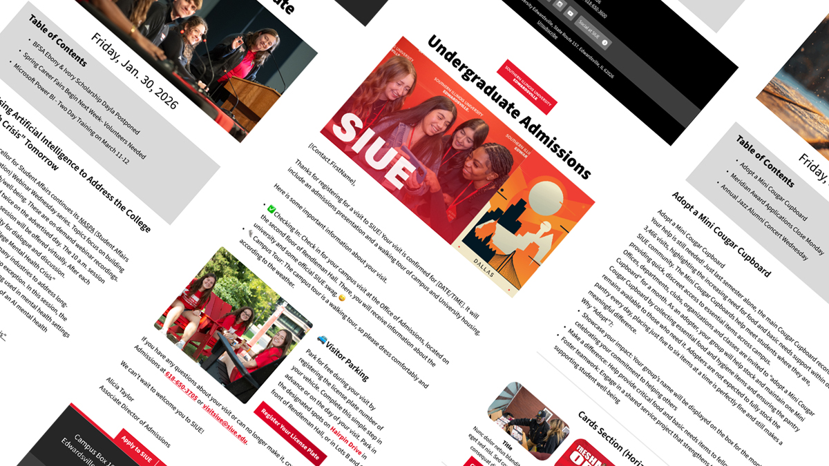
University Communications: Scaling Design through Modular Systems
Transforming a fragmented email landscape into a high-performance, responsive ecosystem across Mautic and Slate.
- The Strategy: Leveraged publication design and MJML-based modular components to move from “static files” to a “guardrail design” system.
- The Results: 600% increase in Click-Through Rates and 450% increase in readership, resulting in the formation of the first University Email Committee to govern institutional standards.
Check out my Email Template case study here.
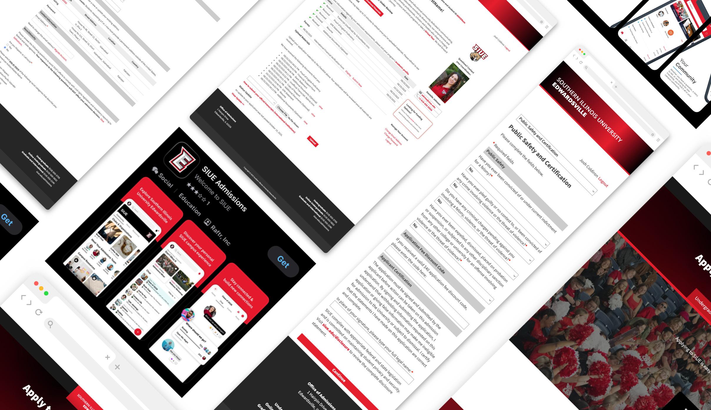
Application Branding
Aligning 3rd Party Systems into SIUE’s Branding
As a digital designer, I unified 3rd-party applications with the SIUE brand to foster institutional trust during the transition between digital utilities. By leveraging advanced browser developer tools, I successfully adapted the Slate CRM into SIUE’s digital ecosystem. Despite the constraints of a fixed framework, I engineered a more focused user flow by eliminating ‘off-ramp’ distractions to directly increase application conversions.
Check out my Application Branding case study here
The UX of the PPT Template System
Enterprise Design Thinking and Design Systems
PowerPoint templates often prioritize the final audience while neglecting the technical skill levels of the staff who must build them. In this project, I approached template development as a Design System rather than a static deliverable. I used the lens of a UX designer to engineer brand integrity and accessibility into the file. By solving for the internal creator’s experience, I ensured the university’s visual identity remains resilient and compliant across all future design campaigns.
Check out my PPT Template System case study here
Student Work
Interactive Design Archives
I received my degree from SIUE with a BFA in Graphic Design and a minor in Computer Science, where I collaborated across departments to build a custom HCI-focused curriculum. My academic journey was defined by a ‘deep-dive’ mentality—earning an URCA grant to develop a web-based design education tool and collaborating with my E-Hacks team to win ‘Best Educational Software. I followed up my degree with certificates from Google’s UX program and IBM’s Enterprise Design Thinking. Below are some samples of my past student work.
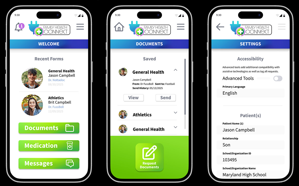
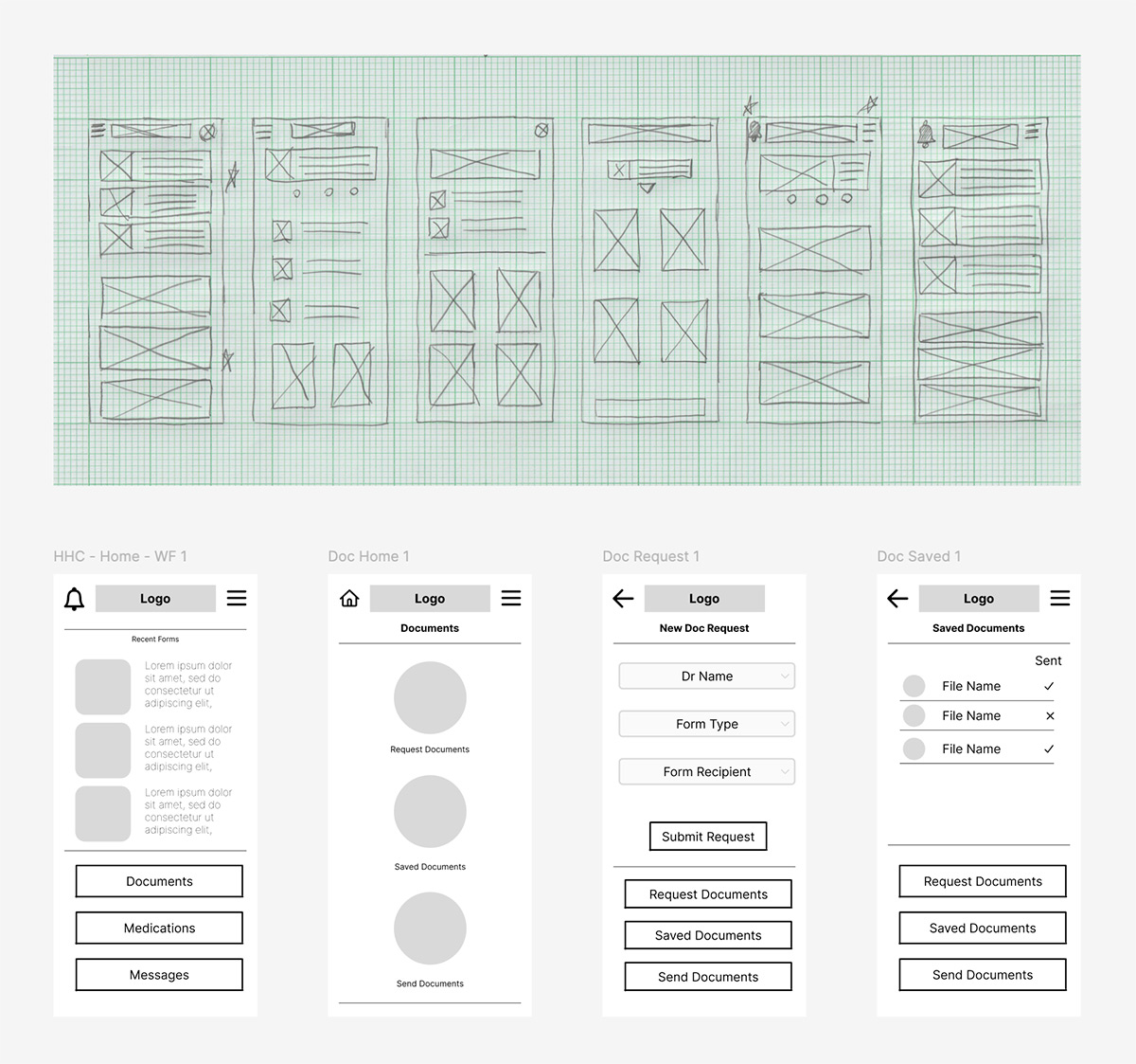
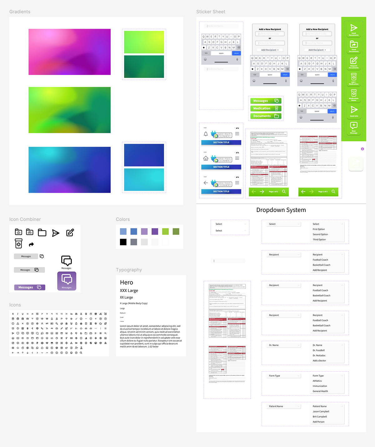
Family Health Connect Mobile APP
Google UX Certificate Project
I developed a comprehensive mobile solution for managing student-athlete medical documentation. By leveraging Figma’s advanced variables and component logic, I streamlined the final high-fidelity prototype by achieving more complex user interactions with half the total screens. This project showcases my ability to balance technical efficiency with the high-stakes needs of healthcare UX.
Check out my FHC Mobile prototype here.
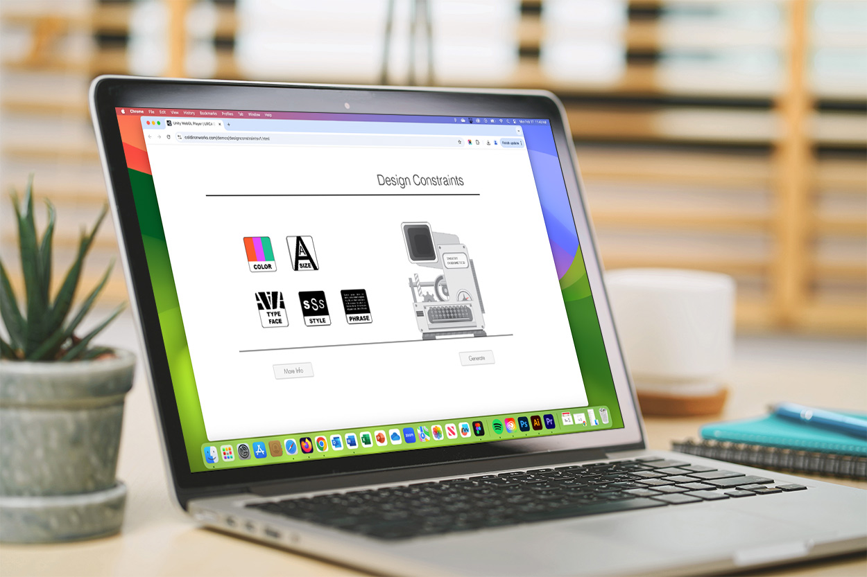
Design Constraints
SIUE URCA Project
This program was the result of a student-funded project I was awarded by SIUE. For the project, I was to develop a teaching tool based on a dice game created by Barb Nwacha. The purpose of the program is to teach typography by limiting the choices and forcing the student to dig deeper to produce an assignment. This works in conjunction with the principles of Massimo Vignelli & Johannes Itten. I coupled this project with my study of the human-computer interface and created a drag-and-drop interface. It was released as a WebGL application in Unity that met our goals.
As a team, we collaborated on developing the concept and conducted interviews to gather user insights. Utilizing research strategies and statistical analysis from testing, we iteratively refined the design. We created prototypes using different media such as paper, web, and an Adobe XD prototype. Throughout the project, I had the opportunity to articulate the reasoning behind design decisions and find compromises that were informed by the collected data. Following graduation, I took the initiative to further enhance the visual design through continued development. Feel free to explore the XD prototype or delve into a more comprehensive overview of this project for a detailed understanding of our approach.
You can try out the application here.
You can explore the case study here.