Design Constraints
SIUE URCA Educational Application
This program was the result of a student-funded project I was awarded by SIUE. For the project, I was to develop a teaching tool based on a dice game created by Barb Nwacha. I handled all aspects of the project from start to finish. The purpose of the application is to teach typography by limiting the choices and forcing students to work within their limitations to produce an assignment. This works in conjunction with the principles of Massimo Vignelli & Johannes Itten. I coupled this project with my study of the human-computer interface and created a drag-and-drop interface. It was released as a WebGL application in Unity that met our goals. The following is the process of developing this project.
Initial Concept
The initial concept was a teaching tool built around the idea of limiting the choices of students to force them to be more creative in their design approaches. During this time we discussed and studied much about the concept of how limiting choices can help designers and users alike come to their results more effectively. While the initial working title of the project was “The Dice Are Nice” we ultimately agreed on “Design Constraints” as the final title.
Having a physical model of the game allowed us to experiment with the game before going onto a digital prototype.
Project Goal Interview
To develop the goal for this project I interviewed Barb Nwacha, the creator of the game.
01
What do the basic functions of the app do?
Provide a set of parameters that forces a young designer to use contrasts, size, typeface style, and serif vs sans serif in a composition.
02
In what task does the app assist? What is the educational goal?
Help students understand aspects of contrast in how they function in a graphic design composition.
03
Who is the primary audience of the app?
Design professors.
04
Is there a secondary audience?
Graphic design students.
05
What environment is it intended to be used in?
Educational institutions.
06
What is the target platform to release the application on?
Mobile app or website.
07
Does the program have settings that may need to be adjusted?
Changing out some of the dice options.
Changing the number of dice.
08
Does the program save data or release data after each use?
Possibly consider the last x size.
09
Does the program need to be able to run its functions multiple times?
Yes.
10
Does this program have potential names?
Dice are Nice (Working Title)
11
What is the visual style?
Possibly inspired by the early Macintosh pixel style.
12
Who else can we interview?
I was provided with a list of students and faculty that could provide feedback over the course of the project.
Goal Assessment
After the initial interview, I was able to establish a focused goal for the project. I then also developed follow-up questions to help create a feature list.
The next challenge became deciding on the platform to launch this product. We only had a couple of months to develop it and I was already learning and utilizing Unity for another project that I was developing alongside this. Using time to learn new technology would have taken valuable time from the UX design process so we agreed to publish the project as a WebGL application built on Unity.
With the collected information and assessment I began the documentation for the project. The goal of the documentation was to solidify our goal as well as our feature list. Due to the short development cycle, and to minimize the risk of failure, I wanted to constrain the major elements of this project to prevent feature creep.
We would still be able to test and evolve the process to achieve the project’s goal but we would not be adding features unless we could argue they would help accomplish the goals of the project in a better way.

Design Document
Description: Dice are Nice (working title) is an educational application that uses randomly selected parameters for students to apply to a design project. This program is built on the UNITY developer engine as a WebGL application. The program’s goal is to help students understand aspects of contrast in how they function in a graphic design composition under the guidance of a professor. The program provides a set of parameters that forces a young designer to use contrasts, size, typeface style, and serif vs sans serif in a composition.
Function:
The application will randomly generate a list of parameters for the designer.
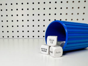
• Two sets of 7 dice and 1 fortune cookie
• Typeset, graphic design set
• Cups work like Yahtzee
Dice components:
Uses the Johann Itten color wheel. Each color has a range of colors based on the wheel.
• (1) Color dice: Currently has 3 color schemes. The outcome is 1/3
• (2) Typestyle dice: Both dice each have a single style. Outcomes are 1/6
• Dice 1 (light, black extra bold, condensed/extended) Outcome is 1/3
• Dice 2 ( Italic, bold, regular) Outcome 1/3
• (4) Size dice: 2 small size groups (12, 20, 16) (24, 36, 48) 2 large size groups (75, 100, 150) (175, 200, 225)
The graphic design set is similar but has tint instead of a color scheme
• Has the same style and form die
• Has type face die. ( Helvetica, Futura ) ½ (Badoni, times new roman, century) 1/3
• Cups work like Yahtzee
Each shake of dice result is for a section of the class. Not individual. (Can be used by individuals as well)
“Type faces are derived by Massimo Vinnela; that you only need 5 type faces your whole career.”
Persona
Harold is a graphic design professor at a small university who has been teaching for a few years. He enjoys the history of graphic design, strong coffee, and all things Apple. His favorite typeface is Frutiger. He learns about an online application that can serve as a teacher’s aide from SIUE. He wants to expand how he teaches typography, so he gives it a shot.

Harold – Graphic Design Professor
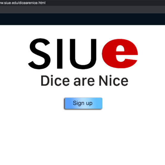
He goes to the URL in his web browser and is greeted by a page from SIUE. It gives him the ability to log in or register. There is also a small section that explains the app and that registration is free.
He clicks on the register link and fills out his profile. It asks for his email, basic info, and to create a password. The next time he returns he will be able to log in using his email and the password he created.

After creating the account he is taken to the application splash screen. The splash screen says “Made with Unity” and has the SIUE logo.
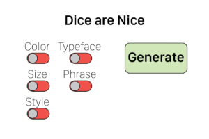
After the splash screen, Harold is greeted with the main menu. The menu allows Harold to select the parameters he wants to randomly generate. Harold wants to see what this program is about so he decided to generate all the options.
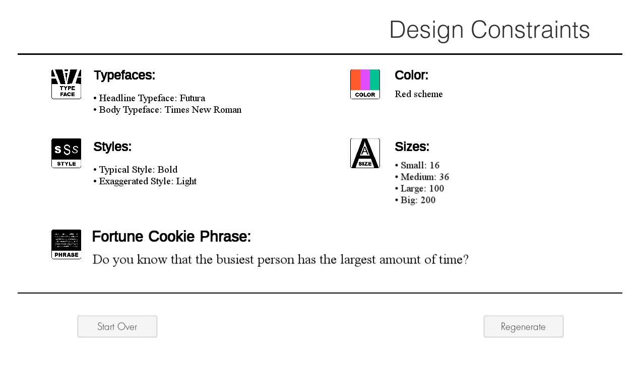
Harold’s Results
Harold gets the following for weight: (12, 20, 16) & (75, 100, 150). He could have also gotten (24, 36, 48) or (175, 200, 225). Weight returns two groups, one small group, and one large group. Both size groups have a 50/50 chance of being selected.
Harold gets the following results for color: purple. He could have also gotten orange or green.
Harold gets the following results for style: light & bold. He could have gotten black extra bold or condensed/extended and italic or regular as his two options. Each set has a 1/3 chance of being selected.
Harold gets the following results for font: Helvetica and Badoni. He could have also gotten Futura and Times New Roman or Century. The top face has a 50/50 chance and the bottom is 1/3. Typefaces are derived from Massimo Vinnela’s concept that you only need five typefaces in your design career.
Harold gets the following results for the phrase: “I knew him well”. The generator will have a small library of royalty-free quotes that it will render for this option giving enough words and verbiage for use in an interesting composition in student designs.
Harold is then able to take his results and made a demo assignment. He later returns to the application during his next class to have his students generate their own results and do a design assignment he has based on this concept.
Exploring use through a persona lets us get into the heads of a user and consider how they may experience the app and how that process might be thought-out to help them reach their goals.
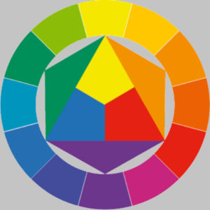
“The colors are based on the Johann Itten color wheel and give him a range of colors he can use as a color scheme related to the color he was given. Under purple the program shows swatches of the colors to use for his color scheme.”
Prototyping
Once we agreed on the required features and project goals we began discussing how we would implement this application. We talked about producing an IOS app, a web page, and an installable application among other things. Ultimately we opted to work in Unity since I was already developing an application in that for another project. During this time we also began shaving off any excessive features such as logins, that we felt may complicate things serverside.
The very first steps were building code a visually basic app that could randomly generate each parameter. Once we had a working system, we started working on basic prototypes to develop the interaction. Since this was a desktop web app we knew our input device would be a mouse, so we started planning out how that might work.
The simplest interaction would be to use radio-like buttons commonly seen on web pages. We wanted the user to be able to select the parameters they wanted and then be able to see the results to apply to their project. We experimented with ideas that expanded on the toggle switches and ultimately settled on a drag-and-drop function for selecting the parameters.
We tested the various prototypes on our user group to see what experiences felt best to them. The app itself is very simple, and we wanted to expand on the user’s interaction and make the experience feel more substantial. We felt requiring the user to move the elements from one array to an area of selection made for an experience that might be supported graphically to be more interesting as well.
Visual Styling
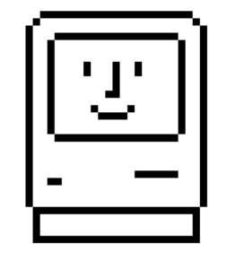
With the concept of interaction tested and coded, we wanted to make the application visually interesting. The game’s creator was interested in finding influence from the early Apple designer, Susan Kare. In addition, I sought out the influence of old machines.
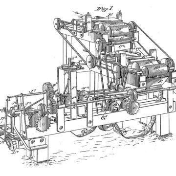
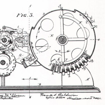
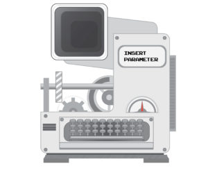
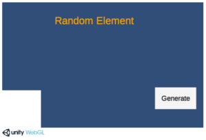
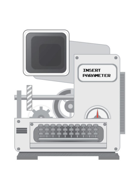
The Machine
In Adobe Illustrator I designed a machine in parts that could be animated. The goal was a call to action that relied on the visual affordances of this machine. The gears turn, the dial moves back and forth, and the machine chugs up and down as if it is producing something. I wanted this machine to also have some character. The dial and gear rest where the eyes might be, and the keyboard is in the place of a mouth.
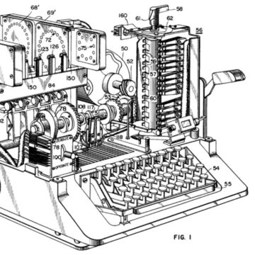
My approach is to allow for user discoverability. I wanted to invoke wonder and curiosity in this experience. To help guide the user I added a flashing text that says “insert parameter “and this empty port that would indicate something is to be placed in this area.
The machine was then implemented into Unity and tested to perfect the animation as well as the interaction itself.
![]()
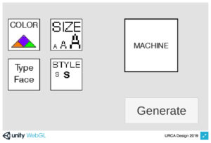
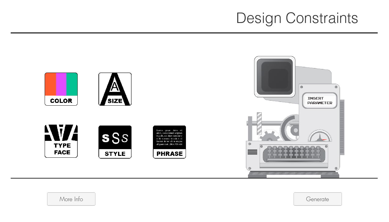
Icon Design
While the initial inspiration was retro Mac icon designs in our testing among stakeholders we opted for a cleaner vector style of graphic. Below are an early concept of “pixel art” style next to its vector counterpart.
![]()
After establishing the goal for the aesthetic I then began the process of designing variations of each parameter tile. Through stakeholder discussion, we chose designs that best convey the parameter they represent. The tile design itself mirrors the shape of the port on the machine so that the user may connect the two mentally.
Repeat
With an app that is largely done we comb over it to resolve anything that we thought could help the user accomplish their goals easier. We worked on the look of the app as well as the interactions needed to help them meet their goals. But what about after those goals? If someone was teaching with this tool they may want the flexibility to produce more results. They could do the process over and over again, or we can add a regenerate button. This button takes the parameters they had selected and then processes them again to generate a new set of random results, so they gain the option to start over and select new parameters or choose to run the same ones again. While this may not be needed it adds a useful tool that can save time in case they come up with a way they want to use this we may not have accounted for.
Completed Project
With the end of the URCA program, I completed the project within the timeframe. Before turning it in, I produced a technical document that explained to a layman how to modify its’ code and components for future students who may take on evolving the program. It was a great learning experience where I was able to manage a project, expand my coding abilities, research, and implement various elements of User Experience. In the end, it allowed my client to reach their goals by having a software-based learning tool that they could share globally, as well as the goals of its users to further expand their skills in graphic design.
You can try out the application here.