Scalable Template System Redesign:
University Cascade Evolution
Intro
In close collaboration with the Digital Director, I served as the Lead Designer for the ground-up overhaul of SIUE’s legacy Cascade CMS ecosystem. While the project was rooted in strategic wireframes and director-level oversight, I owned the end-to-end design execution and systems architecture.
This initiative required transforming initial concepts into a high-performance, WCAG 2.1 AA compliant modular system. I led the development of the visual language, motion design, and technical documentation, delivering a scalable, user-centric refresh that bridged the gap between antiquated infrastructure and modern institutional goals.
- Systems Architecture & Modularity: Engineered a comprehensive library of “Universal Blocks” to replace static, antiquated templates, allowing for a flexible and scalable web ecosystem across diverse university departments.
- Inclusive Design & Compliance: Established WCAG 2.1 AA accessibility as a foundational requirement, ensuring the university’s digital presence is inclusive by default and legally compliant.
- Technical Governance & Vendor Management: Led the end-to-end design handoff and QA process, navigating agency-style billing constraints and technical performance limitations to ensure the final build met the original design intent.
- Data-Driven Iteration: Utilized institutional research and stakeholder feedback to inform the visual hierarchy and motion logic, resulting in a 95% stability rating during the initial User Acceptance Testing (UAT) phase.
Phase 1: The Strategy & System Architecture
Strategic Transition This template system was a collaborative initiative with the University’s Web Director, serving as a cornerstone project before his retirement. My role was to transform his initial structural vision into a high-fidelity, production-ready architecture. This was not a simple visual “reskin”; it was a complete structural overhaul designed to serve as the foundation for SIUE’s digital future. While the legacy template had served its purpose, it lacked the modularity required for modern, responsive storytelling.
Designing for Flexibility and Reach The new system was engineered to exceed WCAG 2.1 AA standards, serving a diverse user base ranging from prospective students to faculty researchers. By evolving initial wireframes into high-fidelity systems, I audited the usability of every interaction. We streamlined user flows by reducing “Call to Action” noise and concentrating focus on single primary touchpoints within each block to eliminate decision fatigue. This iterative process allowed me to identify unmet user needs and propose custom block concepts that balanced institutional goals with user ease.
Functional Color Theory & Branding Working alongside the University’s design department, I navigated the challenge of our primary brand color: #e5182d Red. While red is our core identity, it presents significant accessibility hurdles for contrast and eye-tracking. I established a supplemental digital palette, introducing gradients and secondary tones that provide the necessary visual hierarchy while maintaining brand integrity. These “Digital Brand Guidelines” now ensure that links, titles, and CTAs remain accessible and high contrast across all digital products.
Pacing & Narrative Flow A primary goal was to move the university away from “static information dumps” and toward visual storytelling. By experimenting with alternating compositions, background color shifts, and varied media ratios, I created a “rhythm” for the page. This modularity allows content creators to control the pacing of information, utilizing white space and color blocks to define distinct narrative sections.
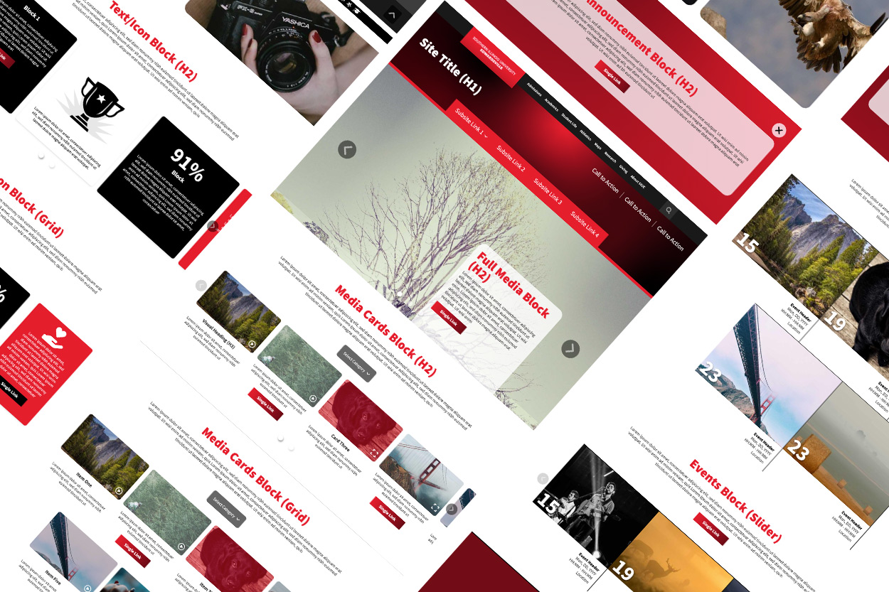
The Component Library
I developed a suite of “Universal Blocks” that empower departments to build custom layouts without breaking brand governance.
- Global Header & Navigation: Re-engineered for clarity with prioritized primary CTAs.
- Half Media + (Enhanced Storytelling): An asymmetrical design allowing for secondary imagery to support complex narratives.
- Media Gallery (Filtered Shadowbox): A high-interaction block for video and images with built-in.
- Text/Icon Cards: Utilizes FontAwesome integration for quick-scan information architecture. Supports images features large calls to action.
- The “Freeform” Utility Block: A flexible container allowing for custom CSS overrides, enabling the team to prototype “one-off” needs without compromising the core template structure.
- Aggregated Content Blocks: Automated feeds for University News, Events, and Calendars to ensure site content remains dynamic and “live” with zero manual maintenance.
- Branded Footer: A unified “bookend” providing institutional trust and essential global links.


Phase 2: Design Execution & Motion
Motion as Functional Utility With the visual architecture established, I pivoted to the motion experience of the site. I treated animation not as decoration, but as navigational feedback. The centerpiece of this logic was the new collapsing gradient header. Designed to trigger at a specific scroll depth, it maximizes vertical screen real estate while providing a “wow” moment that reinforces brand identity.
To turn the header into a functional tool, I engineered a horizontal progress indicator: a bright red segment of the gradient that tracks from left to right in a 1:1 ratio with the page length. This provides the user with immediate visual feedback regarding their location in the content, creating a sense of depth and spatial orientation. I carefully calibrated the parallax timing, easing, and range of motion for hero imagery to ensure the transition between “moving parts” felt fluid and intentional, rather than jarring or staggered.
Responsive Logic & Breakpoints Given the complexity of the motion and modular blocks, a “one-size-fits-all” approach to mobile was insufficient. I established five distinct responsive breakpoints, mapping how every component, from the collapsing header to the media cards, would adapt to varying aspect ratios. This ensured that the developer had a clear roadmap for implementation, maintaining the integrity of the design system across the entire device spectrum.
The Handoff: Technical Specifications & Documentation
To bridge the gap between design and engineering, I compiled a comprehensive Handoff Repository in Ziflow. This wasn’t just a file dump; it was a technical manual for the build.
- Annotated Architectural Wireframes: A detailed breakdown of feature logic with direct links to live behavioral examples.
- Multi-State Adobe XD Prototypes: High-fidelity mocks covering all five major breakpoints to ensure layout consistency.
- Interaction Library: Documented specifications for hover states, button triggers, and slider behaviors.
- Motion Spec Prototypes: Isolated animations for the header collapse and scroll-progress logic to define timing and easing.
- Native Video Integration: Prepared a repository of Yuja-hosted video assets to test and validate the custom video player blocks during the dev cycle.


The Handoff: Animated Demos
The following videos feature Adobe XD-animated examples of the collapsing header and element interactions. The video of the header shows the original animation and the revised design that works within the developer’s constraints.
Phase 3: Implementation, QA, and Strategic Pivots
The Reality of Implementation When the developers returned with the initial build, it became clear that a “Quality Assurance” (QA) bridge was needed to align their technical interpretation with the original design vision. I transitioned from Designer to QA Lead, rigorously testing the template across various devices, operating systems, and browser versions. There were two phases of User Acceptance Testing (UAT): the first, where they launched the template on their server, where we could review the designs they built with the template, and the second, where the template was hosted on our servers, allowing us access to the control panel, where we could test our own designs.
Using Wrike as our central communication hub, I documented bugs and functional discrepancies. This phase was a lesson in Design Compromise: the developers reported that the original complex header collapse was consuming excessive browser resources. To preserve site performance and stay within the technical limits of the CMS, I pivoted, simplifying the animation logic while maintaining the core visual impact. Other features also had to be adjusted to fit within the developer’s capabilities. The most important solutions were to minimize bugs over features. A positive change during the UAT is that we adopted FontAwesome icons rather than developing our own library. This change reduced my bandwidth and allowed me to focus more on the structure and function of the page and rely on a third-party icon system that was easy to add to the CMS.
Managing Technical & Financial Constraints During development, we navigated the complexities of Agency-Style Billing. As I was troubleshooting the initial product, which consumed more hours than forecasted, I had to make high-level decisions on feature prioritization.
Rather than sacrificing quality, we established a “Development Parking Lot.” I identified secondary features, such as the new universal footer, that could be temporarily postponed, ensuring the core template was 95% stable and functional for the initial launch. This strategic “phased rollout” approach allowed us to launch a solid product while preserving a roadmap for future enhancements as budget allowed.


Phase 4: Long-term Governance & Migration
The Strategic “Bridge”: Hybrid Migration
With a massive institutional footprint consisting of thousands of legacy pages, an immediate transition to the new template was a logistical impossibility for our small team. To solve this, I collaborated with the Web Director on a Hybrid Rollout Strategy. I engineered a suite of “Bridge Elements,” which were modernized components adapted for the legacy basic template. This allowed for a seamless visual transition across the entire university site, maintaining brand cohesion while the high-priority student-facing pages were meticulously migrated to the new architecture.
Evolution of the Ecosystem Following the successful launch and the retirement of the Web Director, our remaining team took on the role of migrating our student-facing digital properties to the new architecture. Recognizing the industry shift, I proactively transitioned our design environment from Adobe XD to Figma. Rather than a simple file transfer, I used this as an opportunity to re-architect our library into a robust Design System, integrating feedback from the initial UAT period to ensure our components were as resilient as they were functional.
Architecting the Content Pipeline With a “designed” template now replacing the legacy standard, we required a more sophisticated workflow to ensure quality at scale. My team and I mentored a Graduate Assistant (GA), establishing a standardized Service Design pipeline for site development:
- Discovery & Architecture: Our Information Architect collaborated with stakeholders to map content requirements into strategic wireframes.
- Asset Curation & Support: Our GA managed the media surplus and documented revisions. I personally trained the GA in Figma to handle content-level edits, increasing team efficiency and fostering professional growth.
- Systemic Design: I translated wireframes into high-fidelity mockups using my Auto Layout component library. This allowed us to quickly iterate on compositions that prioritized narrative flow and information hierarchy. This process also established how certain types of content would be standardized, such as contact pages.
- Stakeholder Iteration: We engaged in a collaborative review process, refining the design until it met both departmental goals and institutional standards.
- Technical Deployment: Once finalized, the high-fidelity specs were delivered to the Interactive Media Systems Specialist for precise implementation within the Cascade CMS.
Institutional Impact & Digital Guidelines Success in this project required deep cross-functional collaboration with the University’s Design Department. I was instrumental in aligning our digital efforts with the Visual Identity Requirements (VIR), ensuring our system could support future marketing campaigns without breaking brand logic.
These efforts culminated in the development of new Digital Style Guidelines for the university. Influenced heavily by my commitment to accessibility and inclusive design, these standards became the blueprint for every system I’ve designed since—from third-party integrations and modular email systems to digital signage and enterprise presentation decks. We didn’t just build a template; we created a unified digital ecosystem that maintains institutional trust and brand integrity across every touchpoint.


Retrospective: Navigating the Product Lifecycle
Strategic Prioritization & Vendor Management This was a massive undertaking that provided deep insights into the complexities of a multi-month development cycle. It marked my first experience managing an external agency-style developer, which introduced a different set of challenges than working with in-house teams. I learned to navigate “Agency-Style Billing” by refining my handoff packages to minimize hour usage and maximize technical clarity.
The project also taught me the value of Strategic Descoping. I encountered what I call “Reverse Feature Creep”; the necessity of scaling back specific features due to dwindling technical bandwidth or budgetary constraints while ensuring the core User Experience remained uncompromised. I learned that smart concessions are essential for success; for instance, opting for a robust off-the-shelf icon system allowed me to reallocate my bandwidth toward the critical systems architecture and accessibility compliance that the university truly required.
The Ripple Effect of a Solid Foundation: This project deepened my understanding of how a singular, well-engineered product can serve as a catalyst for an entire digital ecosystem. By applying a combination of visual design, systems thinking, and rigorous QA to a large-scale institutional site, I’ve helped build a foundation that will serve the university and its users for years to come.
- Unified Branding Ecosystem: Created a cohesive digital identity that works in tandem with SIUE’s legacy print assets, ensuring brand consistency across all media.
- Empowered Content Management: Designed a “Self-Service” system that allows CMS managers to build high-performance, on-brand pages without requiring a background in design.
- Measurable ROI: Successfully adapted the template architecture for advertising landing pages, which doubled lead generation and achieved the highest ROI for these assets to date.
- Cross-Platform Translation: Leveraged the core design logic to improve email communications, resulting in a 600% increase in CTR and a 450% rise in readership.

