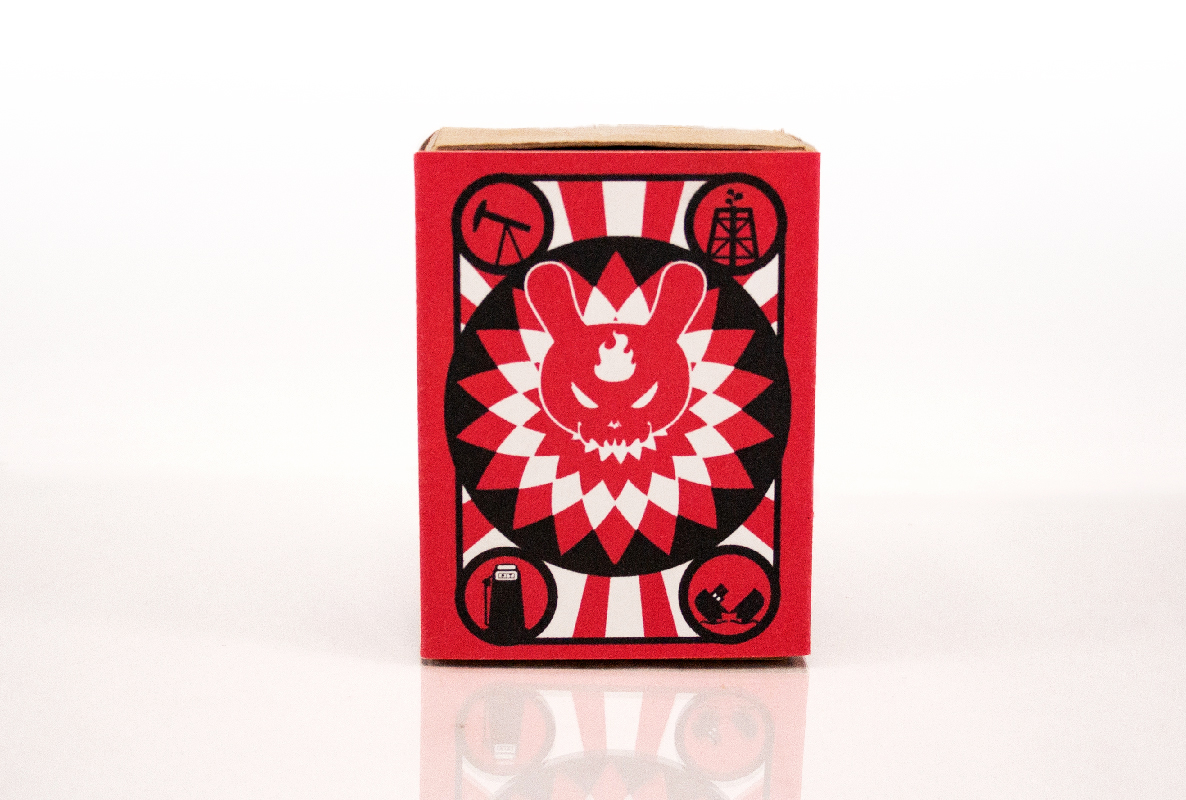
SIUE.edu Redesign
Cascade CMS Block Development and Site Design
The SIUE and SIU web systems run on the Cascade web content management system (CMS). Cascade CMS is designed primarily for higher education institutions, government agencies, and large organizations. It was developed by Hannon Hill and is known for its ability to manage large-scale websites with complex structures while maintaining ease of use for non-technical users. Cascade is a secure, scalable, and structured CMS for managing multiple sites, particularly in education or government. In our implementation, the system relies heavily on existing templates that allow for easy site management across the various university departments. The following case study explores the design and development of a new premium template system to be added onto our existing CMS.
In the sections that follow, I will walk through the various phases of this project, from research and design exploration to development, testing, and implementation. This case study will highlight the key challenges, solutions, and decisions that shaped the new template system.
Project Goals
The primary goal was to develop a new premium template system that can visually work in unison with the existing cascade template system. Additional goals are listed below.
User Experience (UX) Goals:
• Improve Usability & Navigation – Ensure a clear, intuitive structure that helps users find content easily.
• Enhance Accessibility – Meet WCAG & ADA compliance standards for inclusive design.
• Optimize for Mobile & Responsive Design – Ensure a seamless experience across desktop, tablet, and mobile devices.
• Enhance Content Readability – Improve typography, spacing, and contrast for better readability.
• Reduce Cognitive Load – Simplify layouts and interactions to make tasks more efficient.
User Interface (UI) Goals:
• Modernize Visual Design – Update aesthetics with a clean, contemporary look that can support active branding campaigns.
• Consistent Design System – Implement reusable design components for a unified experience.
Improve Call-to-Action (CTA) Visibility – Ensure key actions stand out and guide users effectively.
• Refine Iconography & Imagery – Use high-quality visuals that align with the brand’s identity.
Branding Goals:
• Ensure Brand Consistency – Align the design with the organization’s visual identity (logo, colors, fonts, and style).
• Improve Storytelling & Engagement – Use content layouts that enhance brand messaging.
• Increase Trust & Credibility – Establish a professional and polished look that strengthens the brand’s authority.
• Enhance Personalization – Provide flexibility for different departments/teams while maintaining brand integrity.
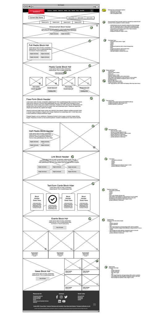
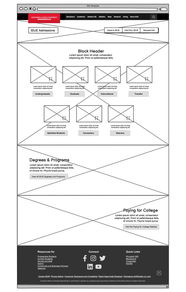
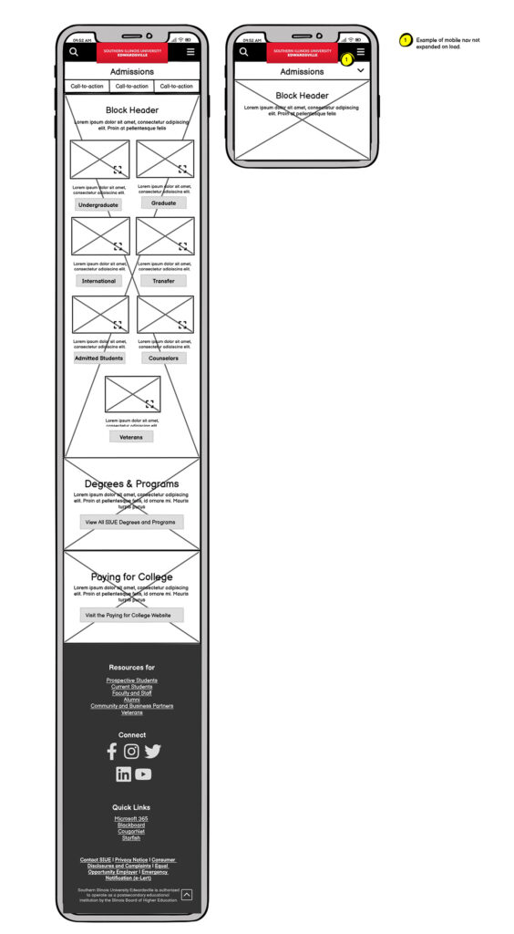
Wireframes
Review and Improve Wireframes
The director had initially created wireframes to define project requirements and budgetary needs before I joined the project. As we developed and tested prototypes, we collaborated to refine existing blocks and introduce new ones. This discovery phase allowed me to expand block functionality by incorporating variants that supported alternating content and improved visual rhythm.
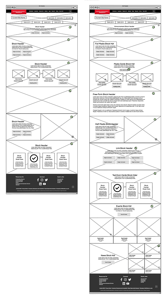
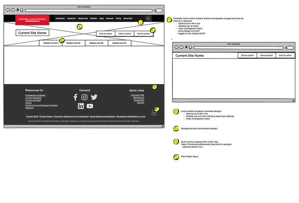
Below, you can view the final wireframes, which served as the foundation for block designs and provided developers with clear specifications for each component. Usability improvements included content filters and multiple ways to display interactive content. These enhancements addressed factors such as the number and placement of calls to action (CTAs) and the flexibility to present cards in stacked or sliding card configurations.
These refinements aligned with the university’s goal of helping users filter relevant information while maintaining a streamlined set of CTAs to prevent overwhelming choices. Additionally, the expanded display options ensured a cohesive design system while allowing key elements to stand out with contrasting visual treatments.
Design Research
My research phase was divided into three parts, during which I also developed the university’s digital style guide and design system.
First, I researched SIUE’s existing site design and branding guidelines to understand their established do’s and don’ts. I also analyzed current marketing campaigns to ensure the block system could seamlessly adapt to their initiatives while maintaining a cohesive brand identity. The primary challenge here was working with elements that were limited and less flexible and trying to relate to them while also being visually neutral.
Second, I developed a digital color palette. SIUE’s signature color was essential to its branding, and supplementary colors had to avoid associations with other schools. Collaborating with the branding manager, we established a secondary color to complement the primary shade and serve as the foundation for site gradients. I also reviewed existing digital colors across the site and other materials, finalizing a palette to reinforce information hierarchy and align with the department’s broader design assets.
Third, I researched current design trends, focusing on those with longevity. While early 2000s-inspired aesthetics were resurging, many were fleeting. Instead, I prioritized composition and interaction design trends, which could elevate the user experience even within a simple layout. Below, you’ll find mood boards capturing my inspiration during this research phase.
Illustrator Exploration & Stakeholder Review
The project had an extremely fast turnaround, so I started working in Adobe Illustrator to streamline the process. With a library of assets from previous digital projects, I could quickly iterate on designs and minimize production time.
I began by blocking out wireframe elements with campaign and styled components to experiment with. Through stakeholder meetings, we compared designs and selected block and UI variations that worked best visually and functionally. I took notes during discussions and refined concepts accordingly, repeating the process until we narrowed everything down to a unified design with well-defined block variations.
In the final phases, budget constraints forced us to put some ideas, like the footer, on hold. To preserve these concepts for future development, we created a ‘parking lot’ for ideas to revisit as budgets allowed.
A key takeaway from stakeholder feedback was the enthusiasm for adopting a more modern, story-driven design. However, due to the slow-moving nature of departmental bureaucracy and funding, we couldn’t stray too far from the existing template. Although we were introducing a new template system, converting over 5,000 pages of content would be extremely time-consuming. Not every page would transition to the new template, so the design needed to maintain enough visual continuity with the existing system to ensure users still felt like they were navigating the SIUE website.
Develop Breakpoint Variations & WCAG Compliance in XD
With the fundamental designs established, I moved on to prototyping. The team initially wanted to stay within the Adobe ecosystem since the university already subscribed to its products. As a result, I transitioned from Illustrator to Adobe XD to develop the block components.
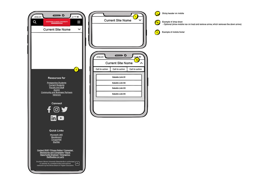
In XD, I created variations of all blocks, defined feature lists and rulesets, and mapped out responsive breakpoints. To maintain structural consistency across desktop breakpoints, we used a scaling ratio that adjusted font sizes based on a percentage of the base rem size. Image containers were also dynamically cropped to preserve framing at different window sizes. For mobile breakpoints, the design became more condensed for easier navigation. Supplemental images and other non-essential elements were removed at this size to prevent unnecessary page length and improve usability.
Throughout the design process, maintaining AA WCAG compliance was a priority. Key considerations included contrast ratios, screen reader integration, keyboard support, and consistent navigation patterns. Since this new template would work alongside existing, compliant templates—such as forms and error handling—we ensured that accessibility remained a core focus.
Develop Interactive Prototypes & Animations in XD
With the template built, I began prototyping interactive elements, including rollovers, navigation, and animations. I aimed to incorporate eye-catching interactions that would enhance the university’s visual appeal. This included animated headers and a parallax effect within content blocks. The header was designed to collapse on scroll, condensing the navigation for a more streamlined experience. To further enhance visual engagement, I developed a gradient effect that shifts horizontally as the user scrolls down the page.
Initially, I considered using After Effects to demonstrate these animations. However, Adobe XD proved to be a powerful tool, allowing me to showcase animations directly within the prototype. This made it easier for developers to see how the animations functioned in response to user actions.
XD also played a key role in user testing with stakeholders. The interactive prototype allowed them to experience the design firsthand, helping us assess which interactions were valuable and which might be unnecessary. We facilitated stakeholder reviews using Ziflow, our existing proofing system, allowing feedback to be gathered without requiring additional training on a new platform.
Key stakeholder feedback incorporated before development included:
Simplified rollover animations for a cleaner user experience.
Sub-navigation dots for slider navigation, improving usability.
Dropdown navigation indicators for better clarity.
Meet with Developers & Provide Documentation
To ensure clear and thorough communication with the developers, I compiled all completed work and organized the final proofs in our Ziflow proofing system. This included:
Annotated wireframes detailing the features and functionality of each block for both desktop and mobile.
Breakpoint demonstrations to illustrate responsive design adjustments.
Navigation and interaction prototypes showcasing user experience flows.
Header animations to demonstrate visual effects.
Links to live sites with similar features we aimed to incorporate, such as parallax scrolling methods.
A detailed outline explaining each proof component, how to utilize the demos, their intended goals, and the expected functionality in the new template.
The director and I then met virtually with the developer, where I walked them through each element and outlined our requirements. During this meeting, I addressed their questions regarding the assets and clarified any uncertainties from my end. Following this, the developer proceeded to build the first version of the design, which we would review and test in the next phase.
Design Review & Bug Testing
During this phase, the developer hosted the new template with placeholder content on their system. I reviewed the designs, compared them against the documentation, and tested the template on a variety of devices to identify bugs. Any issues found were submitted via Wrike for revisions.
Additionally, we had to negotiate certain design elements and features with the developer. For example, the original header design exceeded their capability to maintain a lightweight structure, so I created a revised header animation as a compromise. This process lasted about a month, during which we also evaluated whether any features fell outside our budget. The new footer design, for instance, was ultimately postponed and added to our “parking lot” for future implementation.
To ensure accessibility, I tested the design on both modern and older devices, including browsers and mobile devices that were up to a decade old. While most bugs were resolved, we discovered that an iOS device that ceased support in 2019 could not properly display certain elements in Safari. After analyzing our user data, we determined that the affected audience was too small to justify allocating resources for a fix.
One of the biggest challenges we faced was the loss of information over time between the initial proof meeting and the first development implementation. Some notes may have been overlooked, and certain details were forgotten. To mitigate this in future projects with external developers, a mid-phase review meeting should be scheduled to ensure all features are still understood before the testing phase.
Another challenge was that some requested components were implemented using off-the-shelf APIs, which did not always support the specific features we had designed. This led to a decision point: whether to allocate developer hours to customize the API or adjust our expectations to align with its limitations.
Transition from XD to Figma & Design System Creation
During my research on streamlining our process, I discovered that Adobe XD was being placed into Maintenance Mode and was reaching the end of its lifecycle. With this news, I successfully convinced the team to transition to Figma. While this required additional work on my part to develop the design system and rebuild templates, I saw it as a worthwhile long-term investment.
To speed up the transition, I leveraged SVG assets and Figma’s advanced copy-and-paste features, allowing me to efficiently transfer the system. I also onboarded the team with minimal training, enabling seamless online collaboration.
With the new system in place, I collaborated with our information architect to translate existing sites into the new design. As we reviewed content, we identified additional ways to utilize design blocks and expand the site’s design language. Using Figma, we then met with department stakeholders to gather feedback on the designs. This required balancing client requests with our commitment to design and accessibility standards.
A key insight gained during this phase was identifying potential block feature expansions. One feature I proposed was the ability to combine blocks to create the appearance of a single, unified block, enhancing design flexibility. Reflecting on the process, I realized that having access to fully developed content at the start of the project—rather than relying on lorem ipsum—could have helped uncover these feature needs earlier.
User Acceptance Testing (UAT) & Future Rollouts
The final phase before rollout was User Acceptance Testing (UAT), where the implemented code was deployed onto our live servers. At this stage, we gained access to the back-end interface and could begin building pages. This phase was critical for ensuring the transition from design to development was executed correctly and for identifying any new bugs that arose post-launch.
We began with a meeting with the developer to address questions and receive a briefing on the tools available to us. This session allowed us to clarify how certain design elements should be implemented and to identify any features that were missing or misunderstood in previous phases.
During testing, we discovered that the developer had misunderstood the intended usage of certain blocks. Instead of being optional, some blocks were set as mandatory components on every page. This issue was only visible once we had full access to the system, as the previous mock-ups had been built by the developer. As a workaround, we had to find a way to deactivate certain blocks for pages where they weren’t necessary.
Our Media Systems Specialist joined me in the bug testing process. While I focused on design and UX-related issues, they handled structural and functional bugs within the site’s framework. Meanwhile, our director managed ongoing negotiations regarding funding and budget constraints, which also introduced some challenges during this phase.
Ultimately, we were able to shape the site into something close to our original vision, though some compromises had to be made, and additional features were placed in the “parking lot” for future development. One of my biggest takeaways from this phase was the experience of working with an external developer. In my previous game development projects, developers were part of the internal team, allowing for more direct communication and fewer budget limitations. This experience gave me valuable insight into managing budgets, negotiating scope, and setting realistic expectations when working with external developers in the future.
Final Thoughts
Looking back at this project, I am proud of the success we achieved. I developed a modern, scalable template system that balances flexibility with visual cohesion while maintaining alignment with existing site structures. I successfully transitioned the team from Adobe XD to Figma, improving collaboration and efficiency. Additionally, I ensured AA WCAG compliance, enhancing accessibility and usability for all users. Clear documentation and structured communication with developers helped streamline the process.
All of this was accomplished within a highly compressed timeline while balancing my other responsibilities as a Digital Designer at SIUE. This experience reinforced the importance of adaptability, strong documentation, and user-centered design in delivering successful digital projects.
Challenges & Takeaways
Even with our success, this project came with its share of challenges and setbacks. Budget constraints required us to pivot, placing some features in a “parking lot” for future implementation. Additionally, some design elements were misunderstood or lost in translation, leading to unexpected workarounds. This experience highlighted the need for a mid-phase check-in with external teams to improve alignment and reduce miscommunication.
During testing, we discovered that some older iOS devices (unsupported since 2019) had significant display issues. By analyzing user data, we made informed decisions on which browsers and devices to support, balancing accessibility with practicality.
Another key takeaway was the importance of working with real content earlier in the process. Doing so would have helped refine block functionality, so this step will be prioritized in future projects. Additionally, finding the balance between client requests and UX best practices is crucial to delivering a strong final product. While client needs will vary across departments, we will implement stronger guidelines that align with the university’s brand and WCAG legal requirements to reinforce non-negotiable design and accessibility standards.
Finally, the parking lot system proved invaluable, ensuring that strong ideas aren’t lost and allowing for iterative improvements as budgets allow. Despite these challenges, we successfully adapted, found solutions, and refined our approach. Most importantly, these experiences provided valuable lessons, strengthening our strategies for future projects.
Closing:
This project reinforced the importance of collaboration, adaptability, and accessibility in digital design. It also provided valuable experience in working with external developers, managing budgets, and advocating for strong UX/UI practices while meeting organizational constraints. Moving forward, I will take these insights into future projects, ensuring that design processes remain efficient, scalable, and user-focused. You can view my design system and style guide here or continue browsing my UX projects at the link below.
Project Goal Interview
To develop the goal for this project I interviewed Barb Nwacha, the creator of the game.
01
What do the basic functions of the app do?
Provide a set of parameters that forces a young designer to use contrasts, size, typeface style, and serif vs sans serif in a composition.
02
In what task does the app assist? What is the educational goal?
Help students understand aspects of contrast in how they function in a graphic design composition.
03
Who is the primary audience of the app?
Design professors.
04
Is there a secondary audience?
Graphic design students.
05
What environment is it intended to be used in?
Educational institutions.
06
What is the target platform to release the application on?
Mobile app or website.
07
Does the program have settings that may need to be adjusted?
Changing out some of the dice options.
Changing the number of dice.
08
Does the program save data or release data after each use?
Possibly consider the last x size.
09
Does the program need to be able to run its functions multiple times?
Yes.
10
Does this program have potential names?
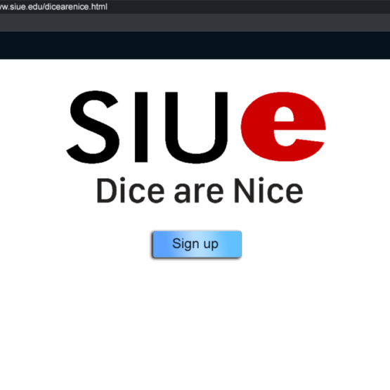
Dice are Nice (Working Title)
11
What is the visual style?
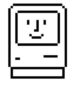
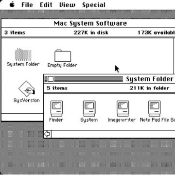
Possibly inspired by the early Macintosh pixel style.
12
Who else can we interview?
I was provided with a list of students and faculty that could provide feedback over the course of the project.
Goal Assessment
After the initial interview, I was able to establish a focused goal for the project. I then also developed follow-up questions to help create a feature list.
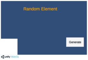
The next challenge became deciding on the platform to launch this product. We only had a couple of months to develop it and I was already learning and utilizing Unity for another project that I was developing alongside this. Using time to learn new technology would have taken valuable time from the UX design process so we agreed to publish the project as a WebGL application built on Unity.
With the collected information and assessment I began the documentation for the project. The goal of the documentation was to solidify our goal as well as our feature list. Due to the short development cycle, and to minimize the risk of failure, I wanted to constrain the major elements of this project to prevent feature creep.
We would still be able to test and evolve the process to achieve the project’s goal but we would not be adding features unless we could argue they would help accomplish the goals of the project in a better way.
Design Document
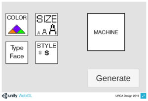
Description: Dice are Nice (working title) is an educational application that uses randomly selected parameters for students to apply to a design project. This program is built on the UNITY developer engine as a WebGL application. The program’s goal is to help students understand aspects of contrast in how they function in a graphic design composition under the guidance of a professor. The program provides a set of parameters that forces a young designer to use contrasts, size, typeface style, and serif vs sans serif in a composition.
Function:
The application will randomly generate a list of parameters for the designer.
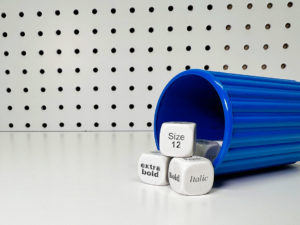
• Two sets of 7 dice and 1 fortune cookie
• Typeset, graphic design set
• Cups work like Yahtzee
Dice components:
Uses the Johann Itten color wheel. Each color has a range of colors based on the wheel.
• (1) Color dice: Currently has 3 color schemes. The outcome is 1/3
• (2) Typestyle dice: Both dice each have a single style. Outcomes are 1/6
• Dice 1 (light, black extra bold, condensed/extended) Outcome is 1/3
• Dice 2 ( Italic, bold, regular) Outcome 1/3
• (4) Size dice: 2 small size groups (12, 20, 16) (24, 36, 48) 2 large size groups (75, 100, 150) (175, 200, 225)
The graphic design set is similar but has tint instead of a color scheme
• Has the same style and form die
• Has type face die. ( Helvetica, Futura ) ½ (Badoni, times new roman, century) 1/3
• Cups work like Yahtzee
Each shake of dice result is for a section of the class. Not individual. (Can be used by individuals as well)
“Type faces are derived by Massimo Vinnela; that you only need 5 type faces your whole career.”
Persona
Harold is a graphic design professor at a small university who has been teaching for a few years. He enjoys the history of graphic design, strong coffee, and all things Apple. His favorite typeface is Frutiger. He learns about an online application that can serve as a teacher’s aide from SIUE. He wants to expand how he teaches typography, so he gives it a shot.

Harold – Graphic Design Professor
He goes to the URL in his web browser and is greeted by a page from SIUE. It gives him the ability to log in or register. There is also a small section that explains the app and that registration is free.
He clicks on the register link and fills out his profile. It asks for his email, basic info, and to create a password. The next time he returns he will be able to log in using his email and the password he created.
After creating the account he is taken to the application splash screen. The splash screen says “Made with Unity” and has the SIUE logo.
After the splash screen, Harold is greeted with the main menu. The menu allows Harold to select the parameters he wants to randomly generate. Harold wants to see what this program is about so he decided to generate all the options.
Harold’s Results
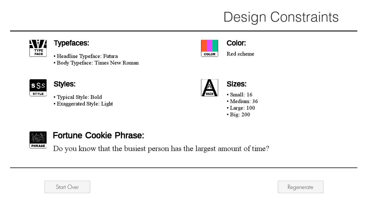
Harold gets the following for weight: (12, 20, 16) & (75, 100, 150). He could have also gotten (24, 36, 48) or (175, 200, 225). Weight returns two groups, one small group, and one large group. Both size groups have a 50/50 chance of being selected.
Harold gets the following results for color: purple. He could have also gotten orange or green.
Harold gets the following results for style: light & bold. He could have gotten black extra bold or condensed/extended and italic or regular as his two options. Each set has a 1/3 chance of being selected.
Harold gets the following results for font: Helvetica and Badoni. He could have also gotten Futura and Times New Roman or Century. The top face has a 50/50 chance and the bottom is 1/3. Typefaces are derived from Massimo Vinnela’s concept that you only need five typefaces in your design career.
Harold gets the following results for the phrase: “I knew him well”. The generator will have a small library of royalty-free quotes that it will render for this option giving enough words and verbiage for use in an interesting composition in student designs.
Harold is then able to take his results and made a demo assignment. He later returns to the application during his next class to have his students generate their own results and do a design assignment he has based on this concept.
Exploring use through a persona lets us get into the heads of a user and consider how they may experience the app and how that process might be thought-out to help them reach their goals.
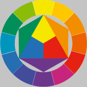
“The colors are based on the Johann Itten color wheel and give him a range of colors he can use as a color scheme related to the color he was given. Under purple the program shows swatches of the colors to use for his color scheme.”
Prototyping
Once we agreed on the required features and project goals we began discussing how we would implement this application. We talked about producing an IOS app, a web page, and an installable application among other things. Ultimately we opted to work in Unity since I was already developing an application in that for another project. During this time we also began shaving off any excessive features such as logins, that we felt may complicate things serverside.
The very first steps were building code a visually basic app that could randomly generate each parameter. Once we had a working system, we started working on basic prototypes to develop the interaction. Since this was a desktop web app we knew our input device would be a mouse, so we started planning out how that might work.
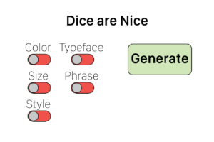
The simplest interaction would be to use radio-like buttons commonly seen on web pages. We wanted the user to be able to select the parameters they wanted and then be able to see the results to apply to their project. We experimented with ideas that expanded on the toggle switches and ultimately settled on a drag-and-drop function for selecting the parameters.
We tested the various prototypes on our user group to see what experiences felt best to them. The app itself is very simple, and we wanted to expand on the user’s interaction and make the experience feel more substantial. We felt requiring the user to move the elements from one array to an area of selection made for an experience that might be supported graphically to be more interesting as well.
Visual Styling
With the concept of interaction tested and coded, we wanted to make the application visually interesting. The game’s creator was interested in finding influence from the early Apple designer, Susan Kare. In addition, I sought out the influence of old machines.
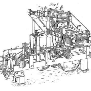
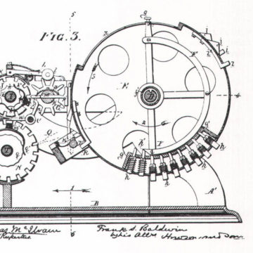
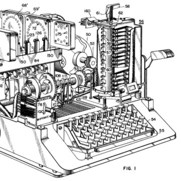
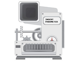
The Machine
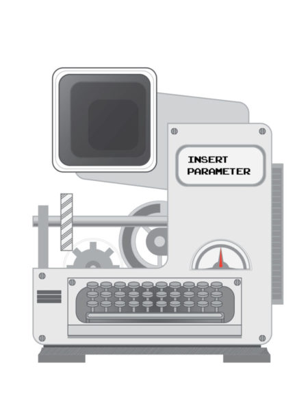
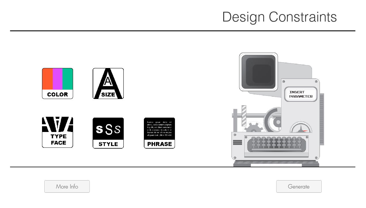
In Adobe Illustrator I designed a machine in parts that could be animated. The goal was a call to action that relied on the visual affordances of this machine. The gears turn, the dial moves back and forth, and the machine chugs up and down as if it is producing something. I wanted this machine to also have some character. The dial and gear rest where the eyes might be, and the keyboard is in the place of a mouth.
My approach is to allow for user discoverability. I wanted to invoke wonder and curiosity in this experience. To help guide the user I added a flashing text that says “insert parameter “and this empty port that would indicate something is to be placed in this area.
The machine was then implemented into Unity and tested to perfect the animation as well as the interaction itself.
Icon Design
While the initial inspiration was retro Mac icon designs in our testing among stakeholders we opted for a cleaner vector style of graphic. Below are an early concept of “pixel art” style next to its vector counterpart.
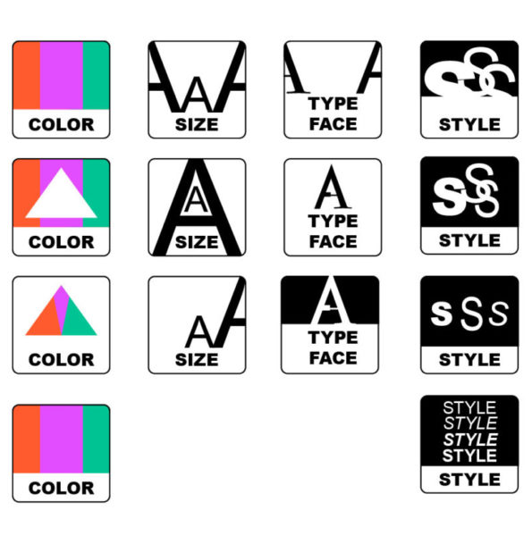
After establishing the goal for the aesthetic I then began the process of designing variations of each parameter tile. Through stakeholder discussion, we chose designs that best convey the parameter they represent. The tile design itself mirrors the shape of the port on the machine so that the user may connect the two mentally.
Repeat
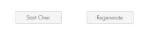
With an app that is largely done we comb over it to resolve anything that we thought could help the user accomplish their goals easier. We worked on the look of the app as well as the interactions needed to help them meet their goals. But what about after those goals? If someone was teaching with this tool they may want the flexibility to produce more results. They could do the process over and over again, or we can add a regenerate button. This button takes the parameters they had selected and then processes them again to generate a new set of random results, so they gain the option to start over and select new parameters or choose to run the same ones again. While this may not be needed it adds a useful tool that can save time in case they come up with a way they want to use this we may not have accounted for.
Completed Project
With the end of the URCA program, I completed the project within the timeframe. Before turning it in, I produced a technical document that explained to a layman how to modify its’ code and components for future students who may take on evolving the program. It was a great learning experience where I was able to manage a project, expand my coding abilities, research, and implement various elements of User Experience. In the end, it allowed my client to reach their goals by having a software-based learning tool that they could share globally, as well as the goals of its users to further expand their skills in graphic design.
You can try out the application here.