University Advertising Landing Pages
Intro
The SIUE Marketing team collaborates with an agency to develop campaigns and track KPI of products used in campaigns. The university utilizes advertising landing pages to develop leads that convert into enrolled students. University Marketing partnered with BAM to develop a mockup of a suggested landing page under the new visual campaign. I acted as the strategic bridge between the agency’s creative vision and the university’s technical framework.
Building upon a new Cascade CMS template I had recently developed, I performed a baseline UX refinement on the initial designs. This included:
- Accessibility: Increasing color contrast to meet WCAG standards.
- UI De-cluttering: Removing redundant elements, such as “Apply” buttons placed directly over “Apply” blocks.
- Conversion Optimization: Replacing external “off-ramp” links with high-value campaign content to keep the user within a focused “brochure” experience.
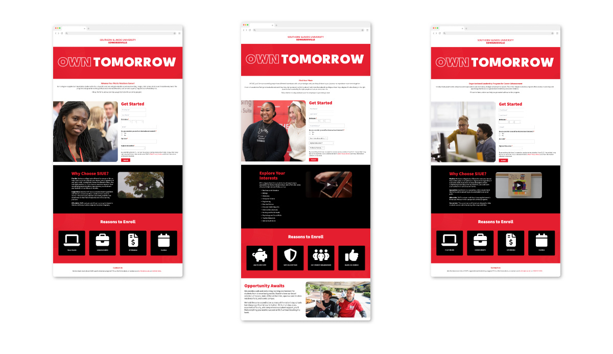
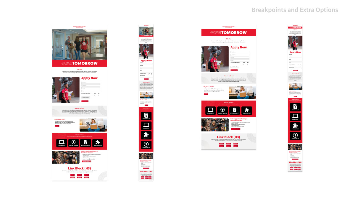
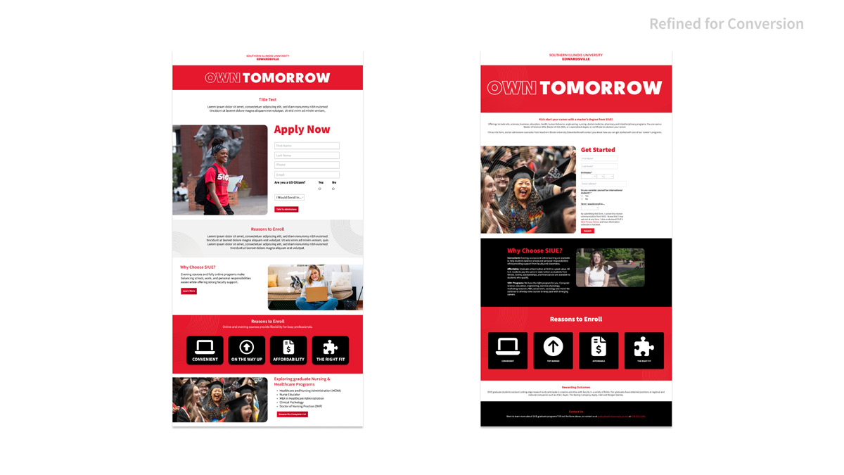
Before and After
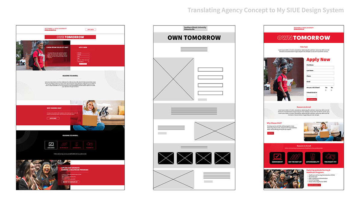
Working with Agency partners to adapt the project into our cascade template system.
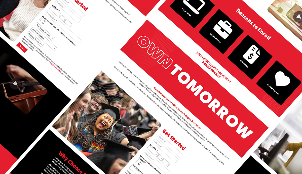
- From their design, architecture was planned out in a wireframe, then built in my design system to help select the elements that best suit this project.
- Once the blocks were selected, further iterations were made to bring contrast levels up for accessibility. These examples also introduce additional block options alongside their mobile breakpoints.
- The revised iterations also demonstrate the before and after of additional links removed to assist in lead conversion.
Strategic Logic: Personas & Journeys
To justify the removal of standard site navigation, I mapped the student journey to identify where we might lose potential leads.
Personas
| The Social Scroller | The High-Intent Searcher |
|---|---|
| Source: Instagram / Facebook Ad | Source: Google Search (“Best Nursing Programs”) |
| Mindset: Low attention span; easily bored. | Mindset: Comparison shopping; looking for “Why SIUE?” |
| The Barrier: Navigation links lead them to “explore” the site, where they eventually lose the original task. | The Barrier: Disjointed info leads them away from the application to find specific answers. |
| The Solution: The “Conversion Tunnel”: UI that limits choices to a single path: Complete the form. | The Solution: The Custom Video/Text Block: Provides an immediate, high-impact “Why SIUE” without leaving the page. |
User Journeys
The “Wandering” Path (Initial Mockup)
- Discovery: User clicks a “Apply Now” ad.
- Entry: Arrives at a standard page with a full university header/footer.
- Distraction: User sees a link to more content about “Why SIUE” and follows that to other sections of the site.
- Drop-off: User forgets why they were there. Lost Lead.
The “Focused” Path (Revised Design)
- Discovery: User clicks the same ad.
- Entry: Arrives at the Branded Landing Page. No header. No footer.
- Engagement: User watches the Custom Video Block to see the campus vibe.
- Action: The only clickable path is the lead-generating form.
- Conversion: Form submitted. Lead captured.
Implementation & Technical Deep Dive
Using my established design system, I moved from wireframes to high-fidelity Figma mockups. I provided stakeholders with various block options and mobile breakpoints to ensure the design was as flexible and supported ongoing visual campaigns.
After a few iterations, we came to an agreement on the setup best suited for this campaign. I then handed off my designs to the Interactive Media Specialist for CMS implementation. After implementation, I collaborated with our ITS team to successfully override template system defaults.”
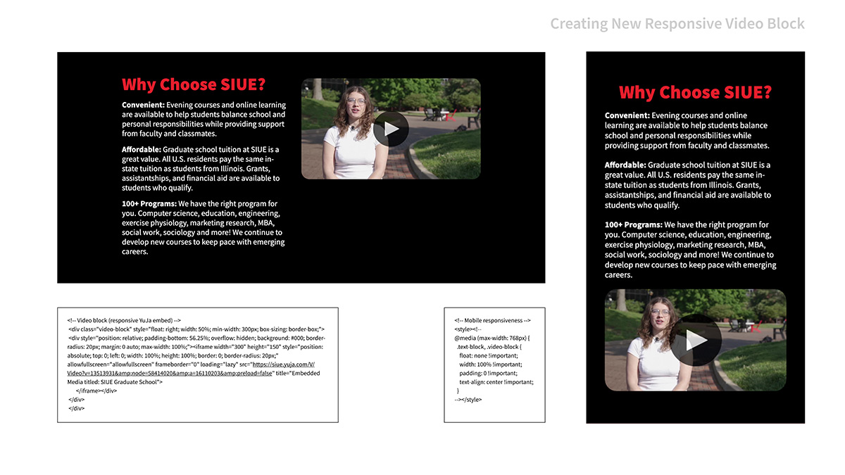
The “Detective” Work: A key challenge arose when stakeholders requested a specific “half-media” video component for YuJa content that wasn’t supported by our standard CMS blocks. I researched and engineered a custom CSS solution to create a responsive container that maintained a 16:9 aspect ratio while stacking cleanly on mobile. This allowed us to create a responsive component that provided a new video option, thus establishing a new block design that we can add to our library.
Impact and Reflection
The launch of this template marked a turning point for our digital marketing efforts:
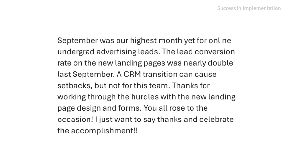
- Record Engagement: This page reported the highest engagement metrics in department history.
- 75% Increase in Conversion: We saw a considerable increase in applications after an annual performance review.
- 51% Decrease in Cost Per Lead: Reduced spending allows us to shift funds to other resources.
- Scalability: We now have a “Master Library” of reusable blocks that can be reconfigured for future campaigns in a fraction of the time.
In this project, I learned some ways to modify existing blocks of our CMS, but also to utilize the design system I developed, and how to present it to stakeholders to encourage adoption by making it more adaptable to the needs of different groups and projects. Through this, I was also able to verify my ideas of funneling the user to complete certain tasks with data, which helps encourage trust between other departments and my team’s ability to produce a successful product. The ultimate success was the scalability of the new template system and its ability to be adapted for unforeseen uses.