University 3rd Party Application Branding
Intro
Branding is the glue that unifies a digital ecosystem. By aligning external utilities, from mobile app icons to the Slate application system, with SIUE’s visual identity, I bridge the gap between third-party functionality and institutional trust.
The Challenge
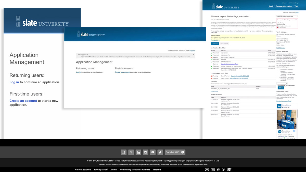
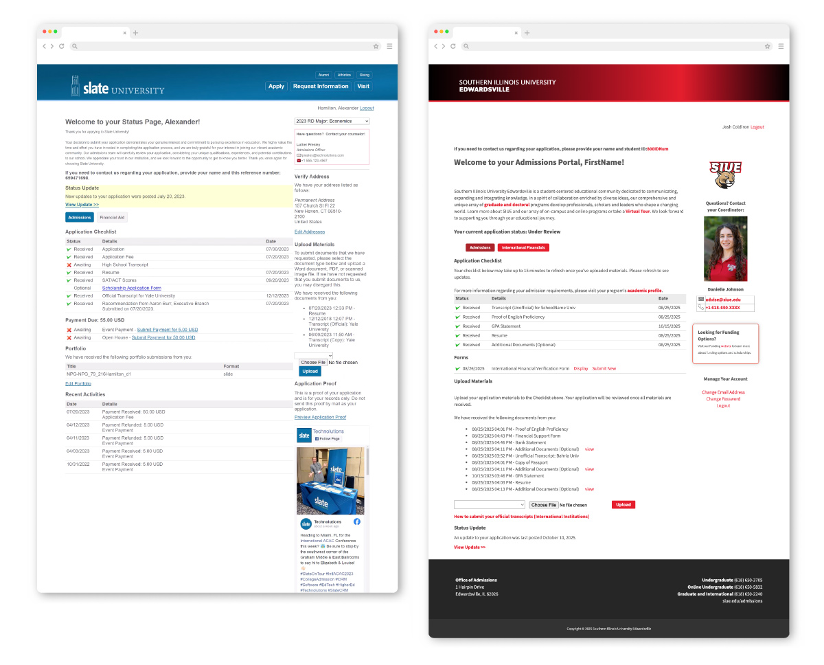
I was tasked with working with our internal Enrollment Systems team to adapt the new website design to the Slate application. When a student moves to 3rd party applications from a high-fidelity Institutional website, a visual drop-off occurs. The lack of brand continuity can reduce trust in data security or highlight how dissimilar two components can be.
This is a two-pronged problem. Working with a fixed structure application, I had to focus largely on visuals to integrate it into our visual ecosystem. The other problem involved making sure we keep the user in the application and do not get led astray.
Following the retirement of my director mid-project, I took full ownership of the Slate adaptation. This required a self-driven deep dive into Slate’s documentation and experimental testing with their AI chatbot to bridge the gap between my existing CSS skills and the advanced techniques required for seamless integration.
Constraints
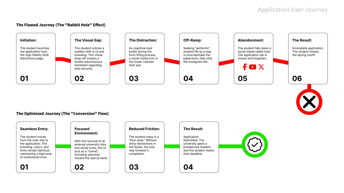
The structure of the page itself, as well as the user flow, was outside my control. To maximize conversion, I focused on reducing cognitive load and distractions. I strategically removed ‘off-ramps’, such as external social and unnecessary links that could lead a student away from the task. By keeping the user focused on the form, we reduced the risk of incomplete applications.
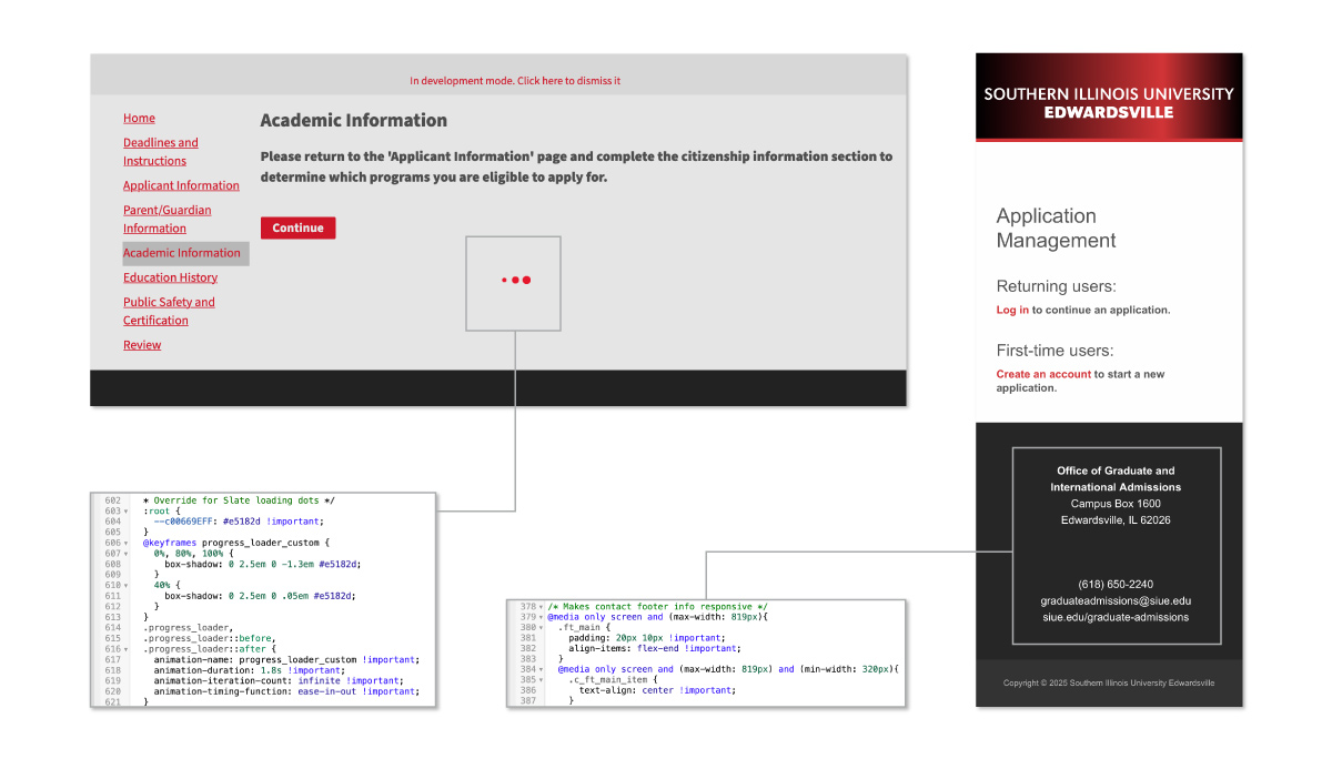
Finding out what elements could be adapted. Some features of the site are written in a more complicated language and have more versatility, while some things, like the headers, are static. Per the documentation, branding is limited through modifying the build.xlt and build.css. While this is correct, simply adding your own CSS was not sufficient.
Technical Deep Dive
This phase was a mix of troubleshooting and ‘digital detective’ work. I utilized browser dev tools to pause processes and identify elusive assets, such as hidden loading animations. A key technical win was implementing cache-busting techniques to force file updates, ensuring we saw the latest UI immediately rather than waiting for system cycles.
As we updated the primary CSS, we found that not everything adapted to our styles. The Enrollment Systems team and I collaborated to comb through the applications with dummy user accounts to find everything that we needed to change. Not everything was visible from a surface level; this even included acceptance letters sent to the user. This part of the problem-solving was very enjoyable to me. I had to utilize the dev tools to find what assets were connected to which styles. This, in turn, taught me more about CSS when I had to override the main.css to get everything to become visually unified. I would then keep archives of CSS changes and update them in Visual Studio Code before implementing them.
The university has one primary branding color, #e5182d, and a few supplemental colors. I have expanded those colors in our digital guidelines and allowed the red to act for emphasis so that it is not overused and passes WCAG AA contrast audits.
Personas
To represent user groups, I created personas of fictional characters. Each persona is tied to a mindset to help translate the problems to the stakeholders.
The Distracted Senior
Name: Jason
- Mindset: “I have 5 tabs open, and I’m halfway through a TikTok.”
- Pain Point: Easily pulled away by tempting links (Social Media).
- The UI Fix: Removing the footer links (the “off-ramps”) kept Jason in the flow until the “Submit” button.
The Cautious Transfer
Name: Marcus
- Mindset: “Is this site legit? I don’t want to leak my SSN.”
- Pain Point: Visual “drop-off” between the main site and Slate.
- The UI Fix: Reskinning Slate to match SIUE’s CSS built the professional trust Marcus needed to enter sensitive data.
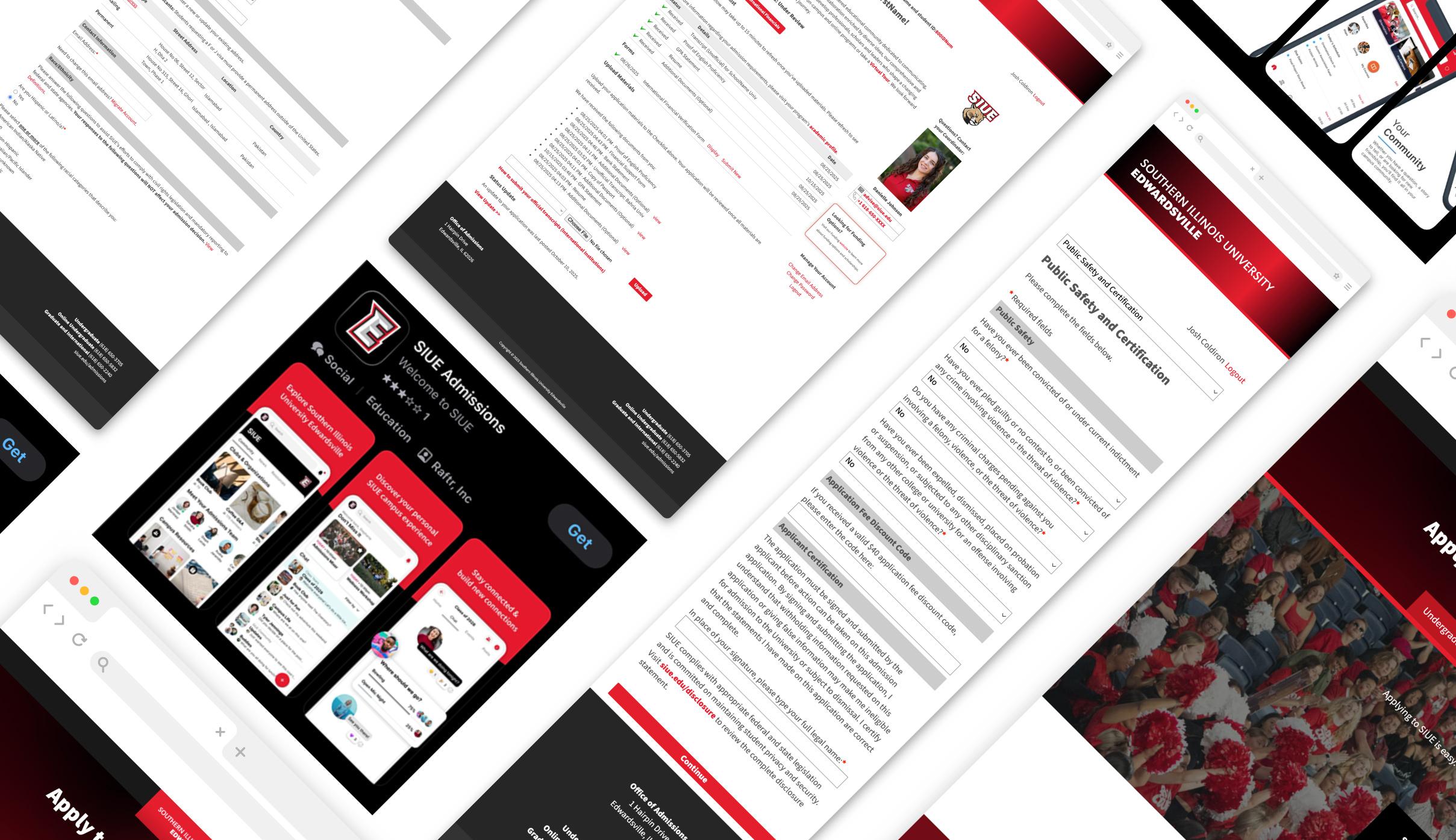
Journey Maps
Here, we examine the journey of filling out an application before and after revisions.
Before and After
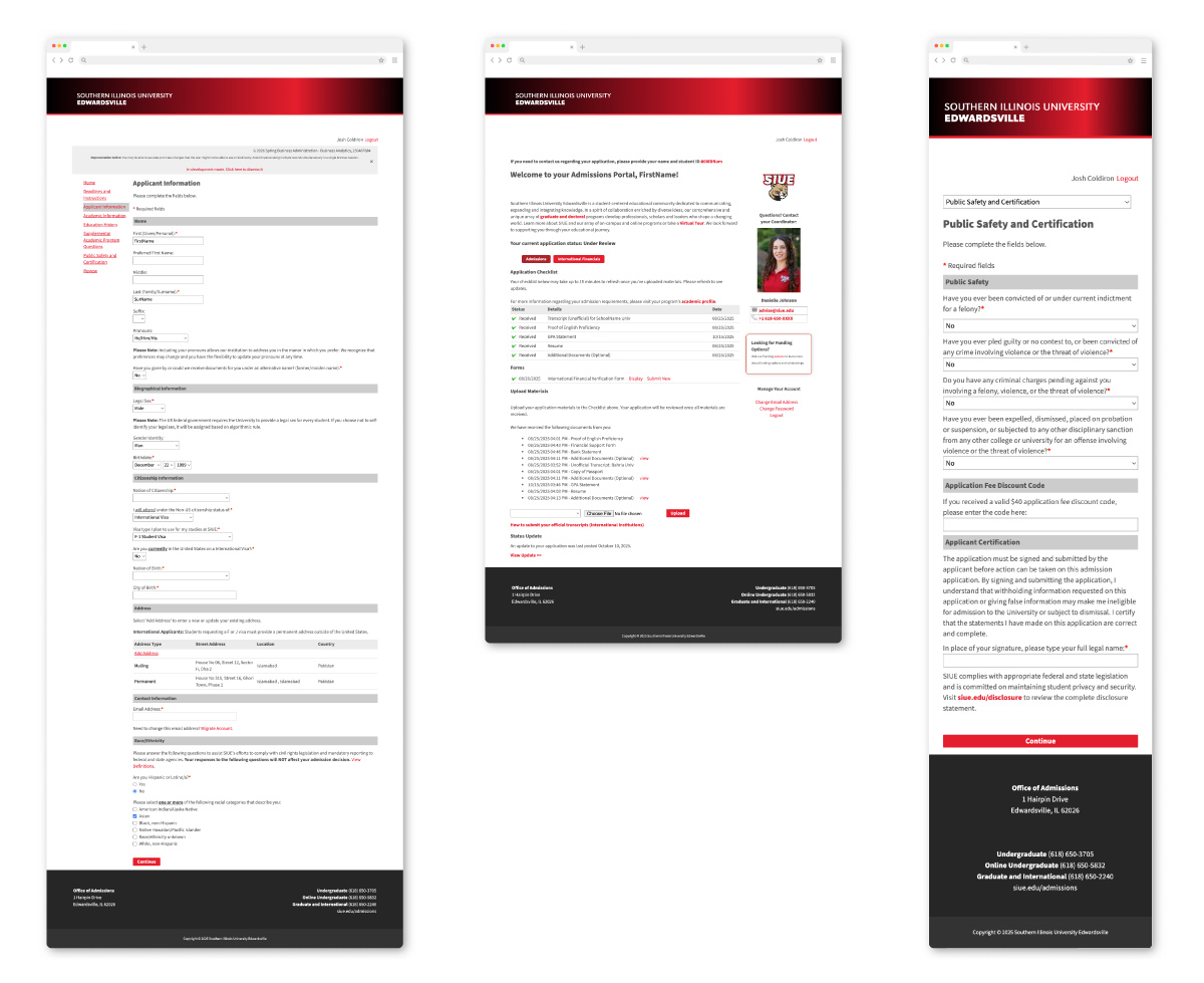
Here is a comparison of the default Slate template adapted to SIUE’s branding.
Impact and Results
While there were limitations to what we could do, visually, the application could be integrated into our university’s visual style and meet our visual identity requirements, as well as WCAG standards. Slate functions effectively and efficiently, and now looks like it was made just for our university. This also resulted in a collection of style snippets that I can utilize in future products that could be used to integrate more web-based products. The result is a Slate interface that feels like a native extension of SIUE. Beyond the aesthetics, this consistency builds user trust. Students feel safer entering sensitive data when the environment looks professional and familiar. By combining brand cohesion with the removal of external distractions, we successfully turned potential ‘drop-offs’ into submitted applications.
Reflections
I learned that perfection is not always possible. You can still create a seamless experience between products within a brand’s ecosystem. These same principles are applied in my Slate email designs, outlined in my email template section. I also learned a greater deal about layers of CSS as well as web development tools that allow me to expand more into other development projects for the university.