University PPT Template as a UX Project & System Development
Intro
PowerPoint presentations are often the ‘last mile’ where brand integrity succeeds or fails. I took on our university PowerPoint template development through user experience lenses. With a recent shift in branding and trying to get the entire campus on board, we needed something more robust than a handful of general ppt template options. Rather than focusing on PPT designs solely on visual impact, I treated this template as a scalable design system, not just a deliverable. This involved developing strict constraints that, even when a non-designer was creating with the template, visual hierarchy and brand integrity remained intact. Through iterative design and testing, I was able to make a system that supported ongoing branding and could be used university-wide.
Research
Discovery & The Initial Loop
While developing templates for the university, I was able to identify issues in the primary design pipeline. The early goals were to create impactful PowerPoint presentations that told a story. I was focused on high-fidelity, which came with a greater complexity. Early stakeholder presentations showed more of a focus on the end user (audience) while neglecting the secondary user (staff creators). This caused me to take a step back and reframe my approach.
The Pivot: Designing for the “Everyperson”
As I worked with different departments, I found issues that ranged from breaking of branding guidelines, accessibility, turnaround time, and skill levels of those working with the files. I realized I needed to approach this in the same way as any interactive project I would want to develop. I had to understand the skill range of the “Everyperson” staff and how they interacted with these templates.
Content Audit & User Research
To understand the technical requirements, I conducted a Legacy Content Audit, reviewing three years of presentations across four key pillars: Orientation, Fundraising, Reporting, and Education. By reviewing this content and speaking to presenters, I identified the modular components they actually needed, such as data visualization layouts and narrative-driven “Hero” slides, rather than just “pretty” backgrounds. Understanding their goals and connecting them to the results for the audience allowed me to consider a list of all likely needs.
Iterative Stress Testing
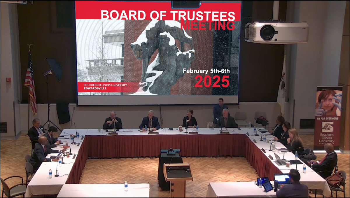
I used high-stakes Board of Trustees presentations as ways to test and iterate designs, alongside designers who were over university branding, and executive staff. I was able to test how the Master Page architecture held up under short turnaround times and last-minute content pivots. These “stress tests” allowed us to see exactly where the logic broke, leading to a refined, bulletproof system that maintained Visual Identity even under extreme pressure
Personas
To represent user groups, I created personas of fictional characters and roles. Each persona is tied to a skill level and a varying degree of stakes involved.
The High-Stakes Visionary
Role: Dr. Alistair Lance, Vice Chancellor of Institutional Advancement
Technical Literacy: Low (Relies on an executive assistant or quick edits)
The Persona: Dr. Lance is the “face” of the university. He speaks to donors, the Board of Trustees, and state legislators. He has 10 minutes between meetings to look at his slides.
- Presentation Goals: Presenting the “Annual Strategic Growth Plan” to the Board.
- Purpose: To inspire confidence, project prestige, and maintain absolute brand authority.
- System Value: He needs “Zero-Friction Fidelity.” The template must look like a professional agency designed it, even if he (or his assistant) just typed in three bullet points. When shown alongside competing schools, it needs to stand out to the audience.
The Storytelling Recruiter
Role: Clara Chen, Senior Admissions Coordinator
Technical Literacy: Moderate (Comfortable with tools, but not a designer)
The Persona: On the accepted student’s day, Clara gives the same presentation three times a day to rooms full of distracted teenagers. She needs his slides to be “Kinetic” and engaging.
- Presentation Goals: “Life at the University” orientation for prospective freshmen.
- Purpose: To build an emotional connection, simplify complex enrollment steps, and “sell” the university experience.
- System Value: She needs “Modular Variety.” She uses the custom placeholders and storytelling layouts to keep the presentation fresh, so she doesn’t get bored—and neither does her audience.
The Data-Driven Academic
Role: Jordan Miller, Graduate Assistant for the Department of Biological Sciences
Technical Literacy: High (Technically savvy, but prone to “data-dumping”)
The Persona: Jordan is brilliant at research but struggles to make it “look good.” They tend to cram 40 lines of text and three complex charts onto a single slide.
- Presentation Goals: Presenting lab results at a regional STEM symposium.
- Purpose: To translate dense, complex data into a readable format that students and peers can actually digest.
- System Value: They need “Technical Guardrails.” The strict constraints on font size and “Safe Space” margins prevent them from overcrowding the slides, ensuring their research is legible.
Journey Maps
Here we examine the before and after of the process of building a presentation.
| Stage | The Legacy Journey (The Friction) | The refined Journey (The Flow) |
|---|---|---|
| 1. Initiation | Clara hunts through her email for the “newest” logo. She finds three different versions. | Clara opens the Master Template. The latest branding is already “baked” into the theme. |
| 2. Assembly | She “Frankensteins” a deck by copy-pasting slides from 2019, 2022, and 2025. | She reads the instruction slides to get an idea of how to approach this project and to begin adding compositions. |
| 3. Content Entry | She types into a blank text box. The font defaults to Calibri 11pt. She spends 20 minutes resizing it. | She clicks the Custom Placeholder. The text automatically snaps to the correct hierarchy and brand font. |
| 4. Visuals | She drags in a photo. It covers the text. She “sends to back” and tries to crop it manually. It looks skewed. | She uses the preplaced image frames. The photo crops perfectly within the “Safe Space” we engineered. |
| 5. The “Fiddle” | She spends 2 hours “nudging” logos and boxes to make them look aligned. (High Cognitive Load) | Branding is locked at the Master level. She doesn’t have to nudge anything. (Low Cognitive Load) |
| 6. The Result | The deck is “okay,” but the colors are not correct on all pages, and the accessibility is zero. She feels exhausted. | The deck is high-fidelity and WCAG-compliant. She feels like a professional designer. |
Pain Points
Through this research, we were able to uncover common issues with building university presentations (Pain Points) and solutions to those problems.
| The Pain Point (Discovery) | Solution (Implementation) |
|---|---|
| Brand Fragmentation: Users often unintentionally deviate from university branding guidelines. Some intentionally try to put their own spin on the design as well. | Systemic Guardrails: I locked the theme colors, font hierarchies, and brand assets within the Master Pages, allowing users to focus only on content. |
| Accessibility Barriers: Past designs could fail WCAG compliance due to poor contrast and small font sizes. | Built-in Compliance: Accessibility is now built into the template designs, ensuring that every new slide meets contrast ratios and legibility standards. |
| The Skill Gap: Most creators are not designers; they often work under tight deadlines, which leads to lower-quality layouts. | Modular Compositions: I developed a library of pre-built compositions. This reduced the need for manual design and provided “plug-and-play” professional layouts. |
| Narrative Friction: Users struggle to translate data into a compelling story or maintain a visual rhythm. | Rhythmic Storytelling: I created alternating slide variations to promote visual pacing. This helps users build a natural narrative flow without design expertise. |
| Onboarding Hurdles: Staff are often unaware of design requirements or don’t know where to start. | Self-Stewarding Documentation: I embedded instructions and design examples directly into the template. This provides real-time training as the user builds. |
While constraints were a large part of the strategy, the templates for advanced users only locked down specific branding elements but allowed flexibility with a large blank slate for any needs that might arise. This ensured the system was inclusive of all skill levels, from basic data entry to high-fidelity creative storytelling.
Problem Statement
The problem of complex templates affects non-designer staff. The impact is low-quality and brand-diluting presentations. A successful solution would allow all skill levels to be able to quickly and easily produce impactful presentations that stay on brand.
The Goal
The primary goal was to engineer a template system that allowed versatility with presenter needs, while preventing the breaking of visual identity requirements. The system needs to work for all skill levels and meet accessibility requirements.
Architecture: Technical Precision
The central key to fully grasping the limits of the branding required working with the university design team to understand the new campaign and VIR (Visual Identity Requirements) in a way to adapt variations of the ongoing designs into compositions. In the beginning, the new visual campaign was still in flux, and I worked with the graphic design team to establish the visual elements and adapt them into a digital format for the design system. I acted as a bridge between high-level graphic design and digital implementation:
- With the feedback from the various testing groups, I was able to plan out the information architecture with wireframes of different element compositions in Figma to ensure logical content flow.
- I then converted graphics from eps to SVG instead of PNG to maintain transparent characteristics, scalability, and file size reduction.
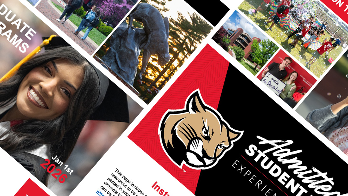
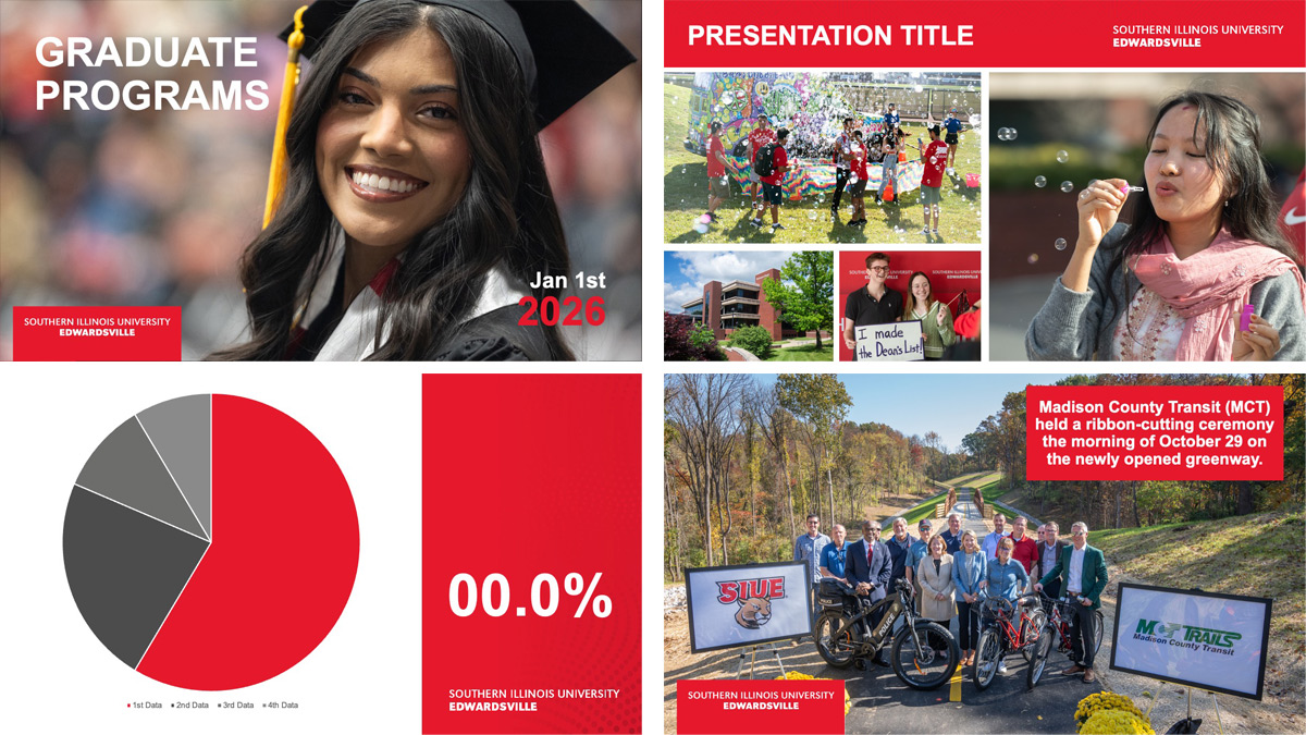
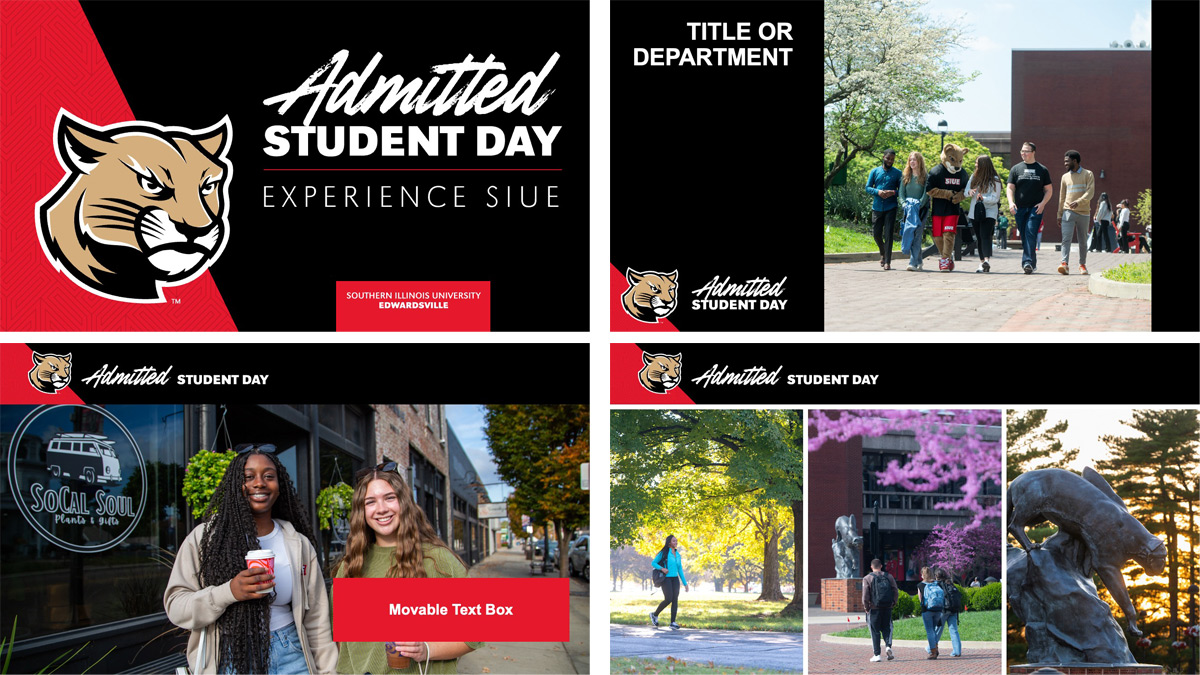
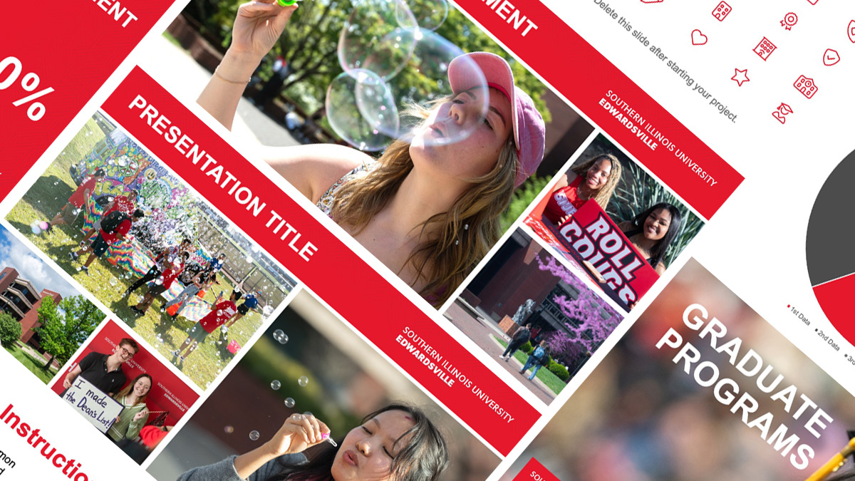
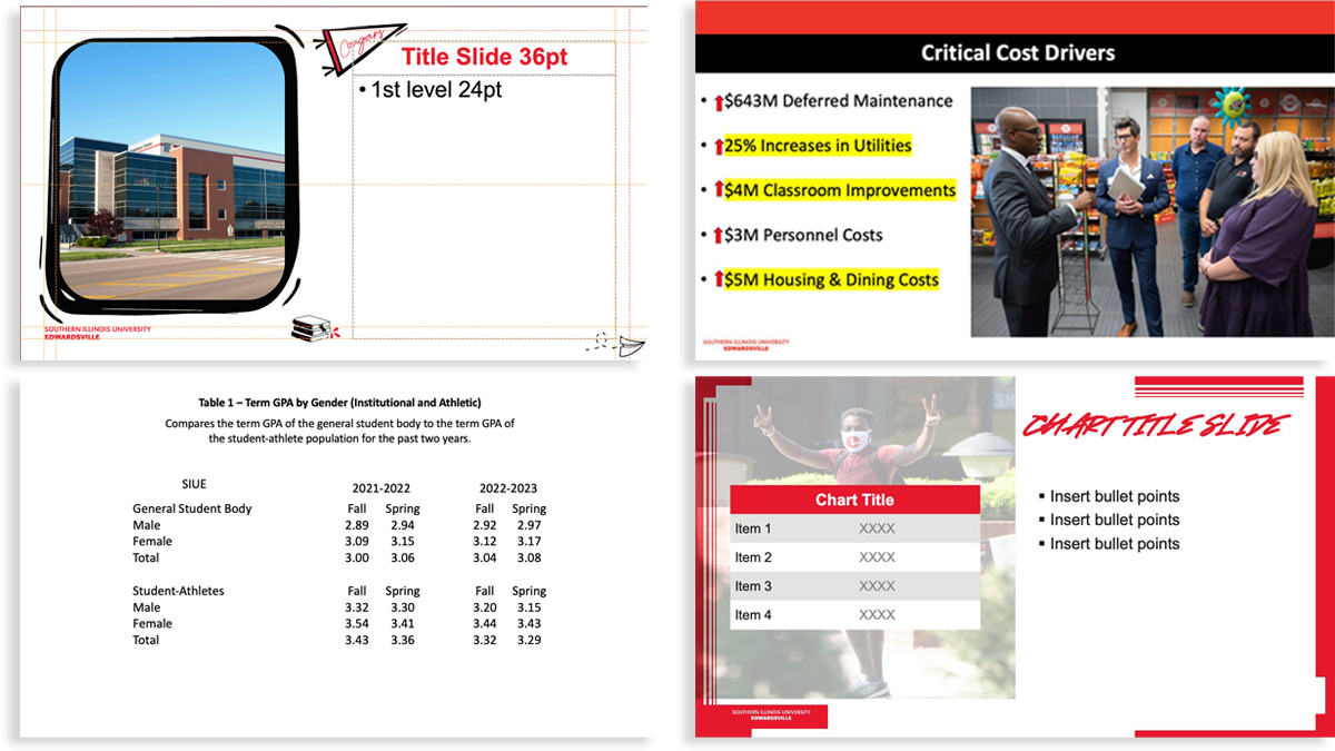
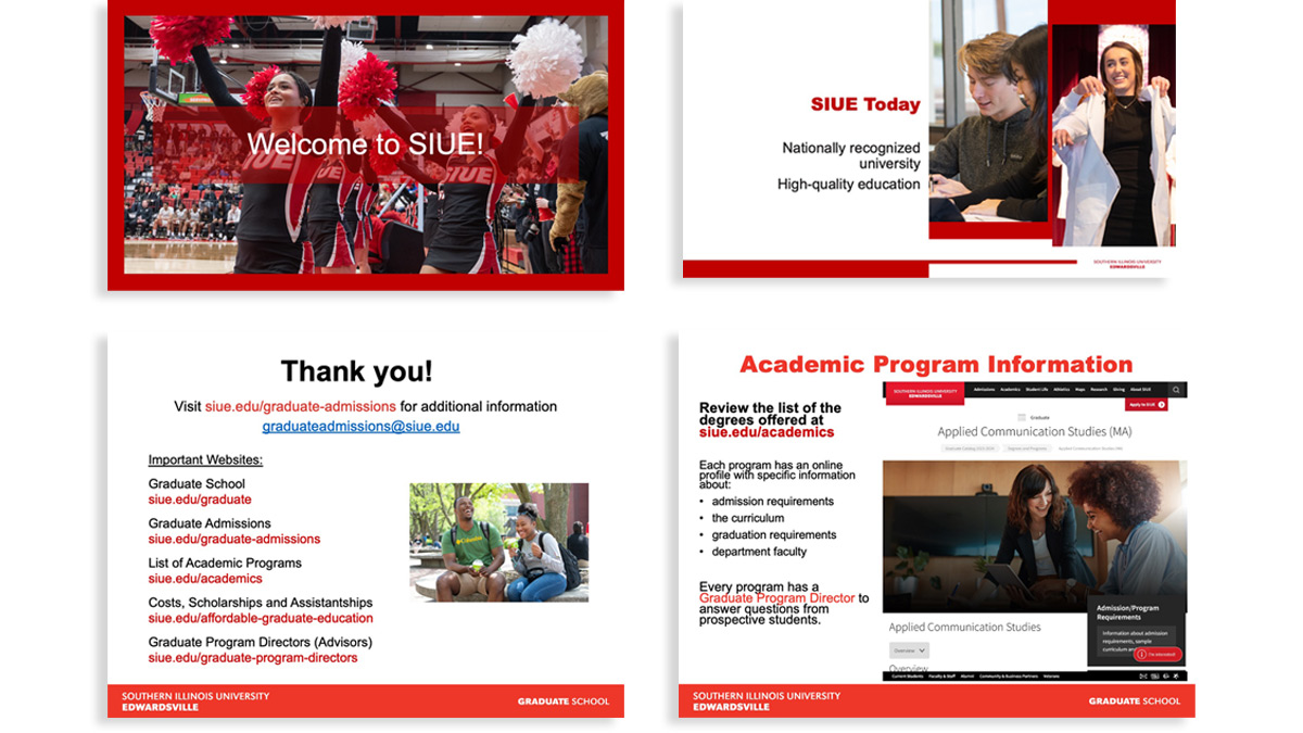
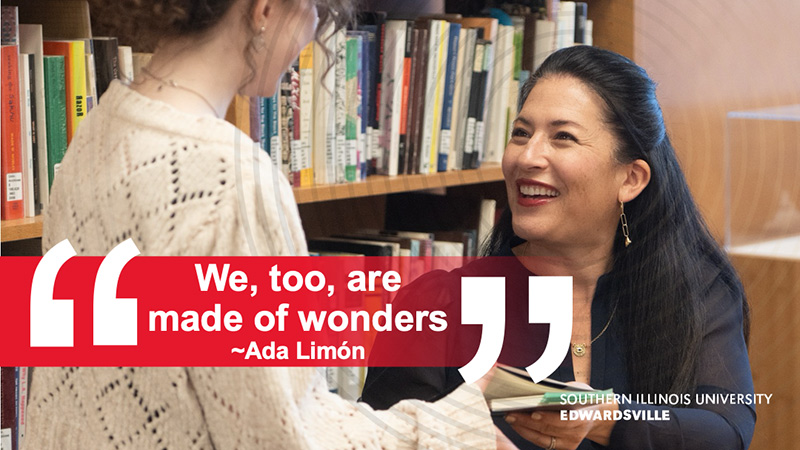
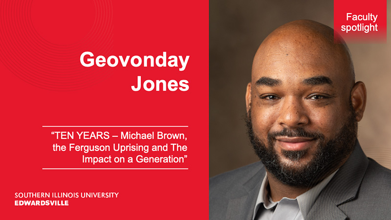
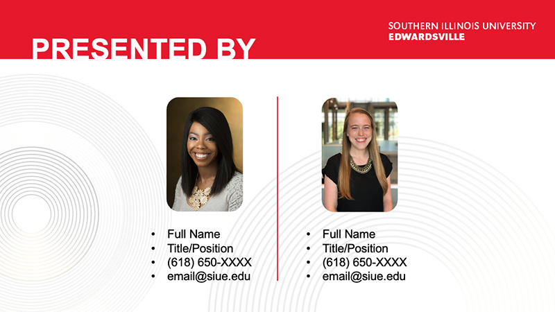
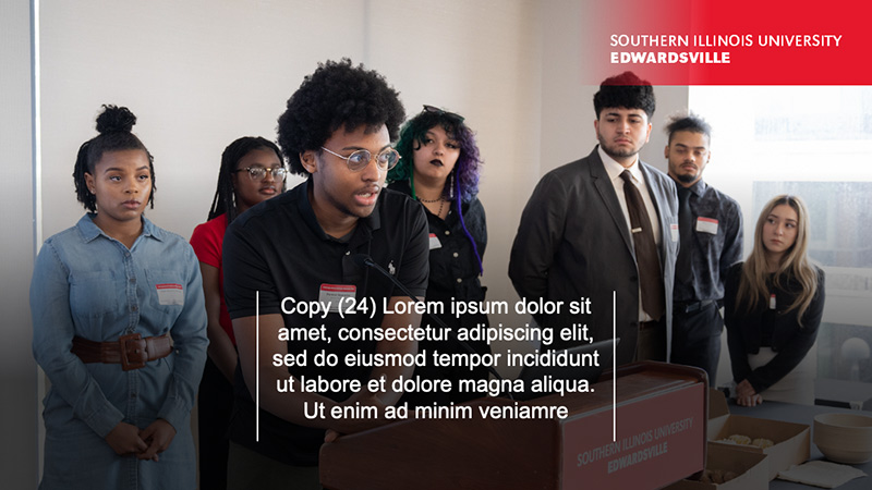
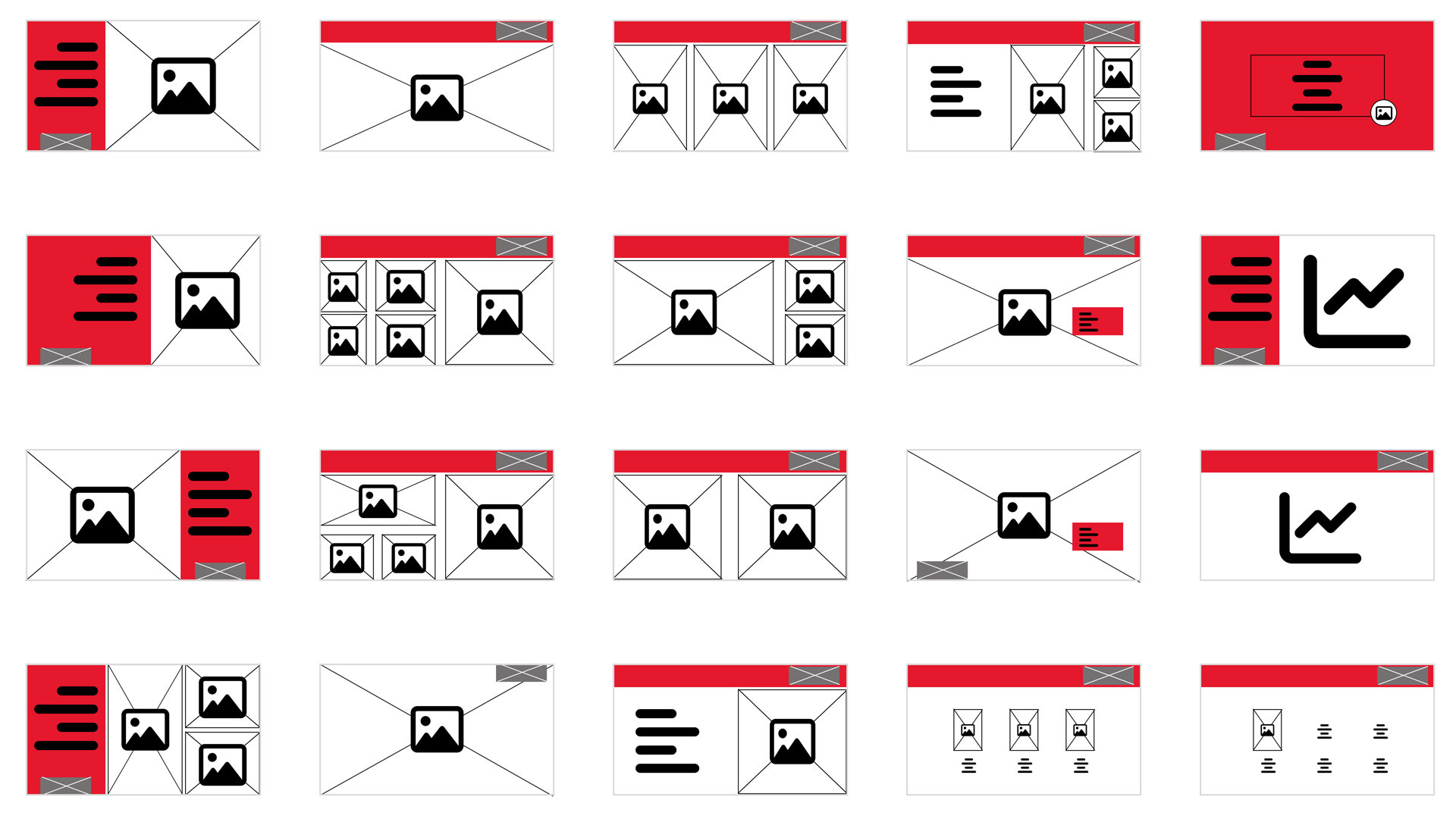
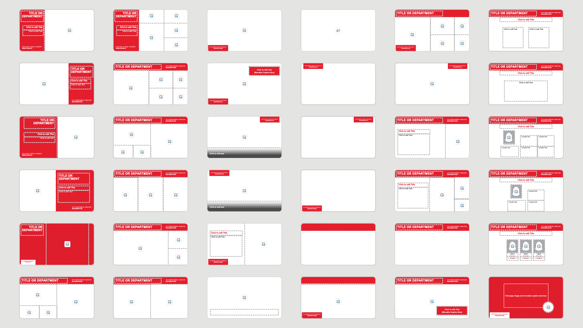
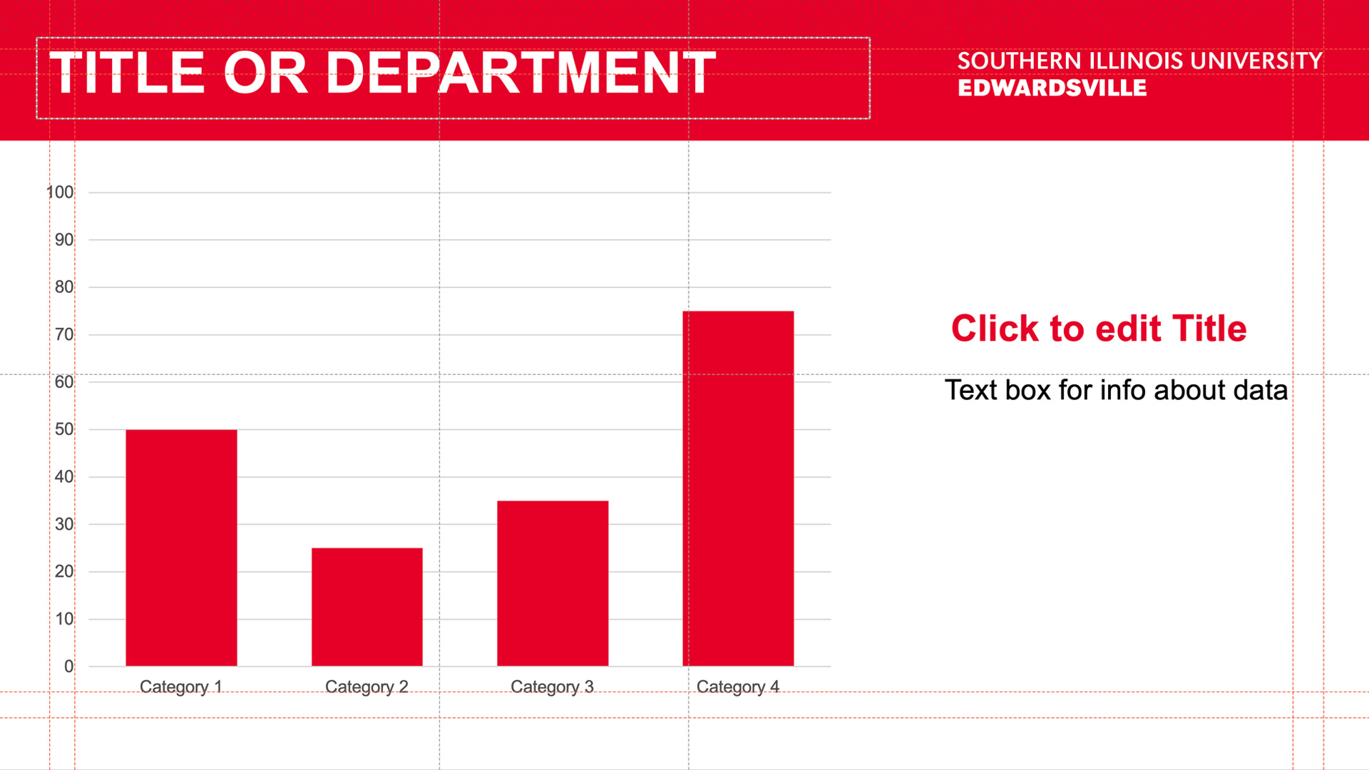
With these assets, I was able to take approved designs that went through our branding department and develop master pages. I had created a framework that passed final branding audits and remained flexible for future campaign iterations. Some samples shown below.
Who, what, wow
In line with Enterprise Design thinking, I considered the “Hill” in this project. I think this incorporation of the “Wow” leads us to consider making the product do more than just its basic functionality and deliver a product that feels intuitive:
(Who) Non-designer “Sponsor Users” that acted as a baseline for skill levels, who were often tasked with high-stakes communication but found blank canvases intimidating.
(What) A modular system that supports diverse university campaigns at any scale.
(Wow) I provided a system where the user doesn’t have to try to be brand-compliant or accessible, and can achieve professional results automatically, allowing them to focus on their message rather than formatting.
The Pivot: Choosing Usability
Initially, I had worked backwards, focusing on the “Wow” factor of high-fidelity layouts and animations. As I was able to have more types of users and observe a range of creation timelines, I realized I need to shift my focus to supporting all user types of the university. While feedback on the animations was that they were visually impressive, they were a technical breaking point for users. This is where the “Wow” shifted from just being what the audience experienced to including what the sponsor users experience.
I conducted a deep dive into the various versions of PowerPoint used across the university to understand the technical limitations of our legacy environment. By matching our visual goals with the actual technical capabilities and skill levels of the staff, I transformed the project from a simple template into a high-performance tool.
Ideation
With established brand foundations in place, I was able to begin to focus on compositions. I had adapted the Figma wireframes into various wireframes. With those layouts, I was able to test them in a variety of presentations for different departments and use cases. Once I saw what worked and didn’t work, I then explored different methods to produce solid designs with usability.
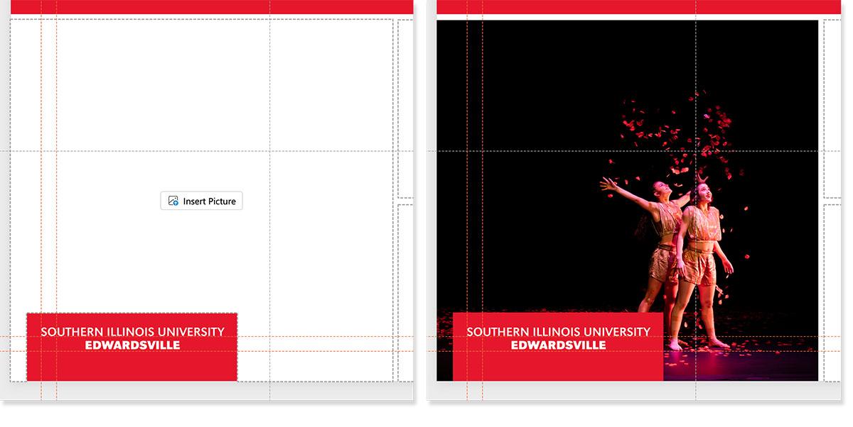
During this phase, I encountered a significant technical hurdle within PowerPoint: the foreground (z-axis) conflict of image placeholders. Standard image containers often move to the foreground when an image is inserted. This placed our locked brand overlays behind the content, effectively breaking the visual composition.
To solve this, I experimented with layered backgrounds but ultimately engineered custom placeholder ‘cutouts.’ By using pixel-perfect measurements and Boolean operations, I created a master page system where the branding remains in the foreground regardless of user input. I validated these designs using built-in accessibility tools and WCAG contrast standards like the ones I use on the university website. This ensures the system was inclusive before submitting the final framework for branding approval.
The Handoff: Instructional Design
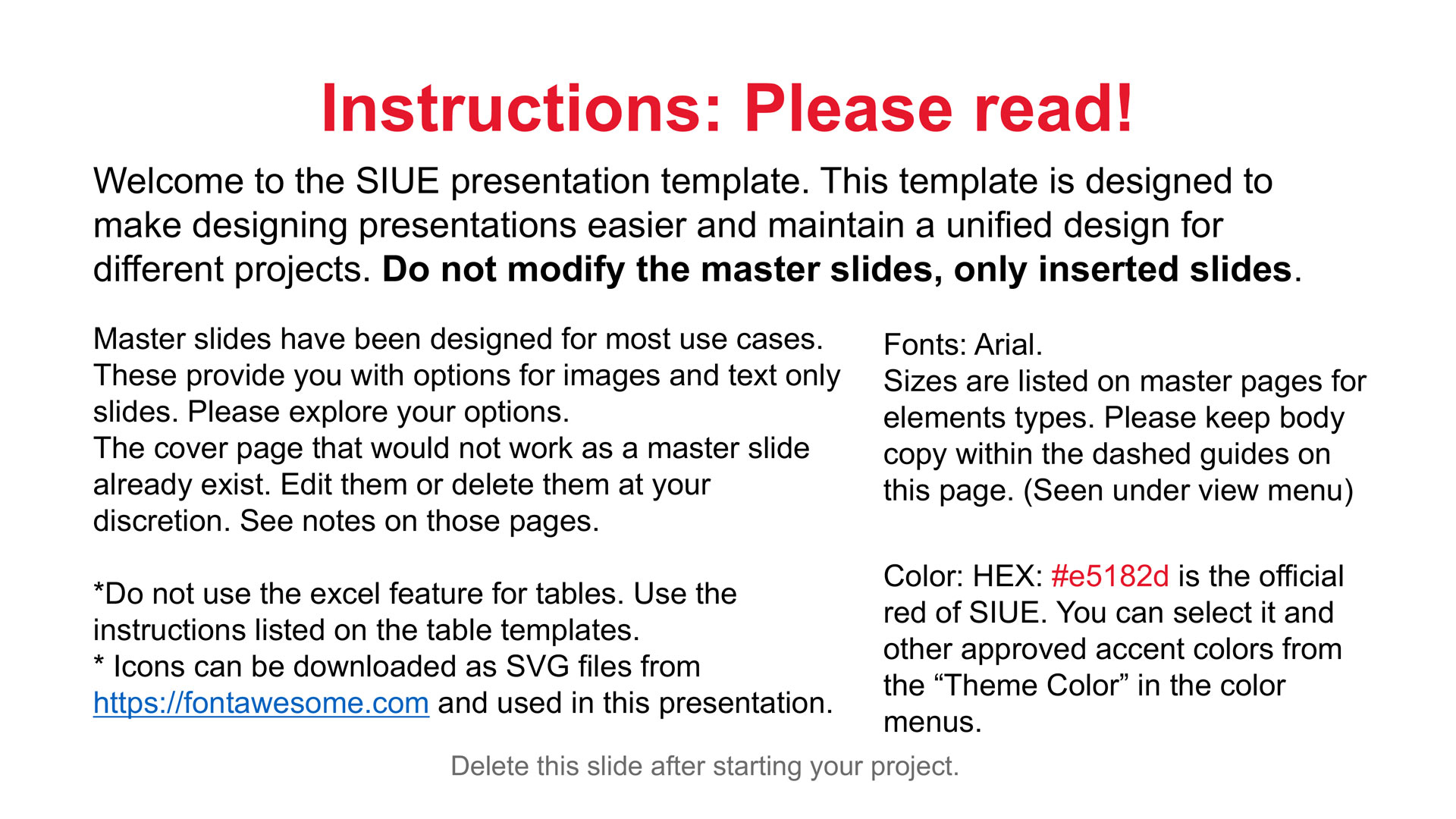
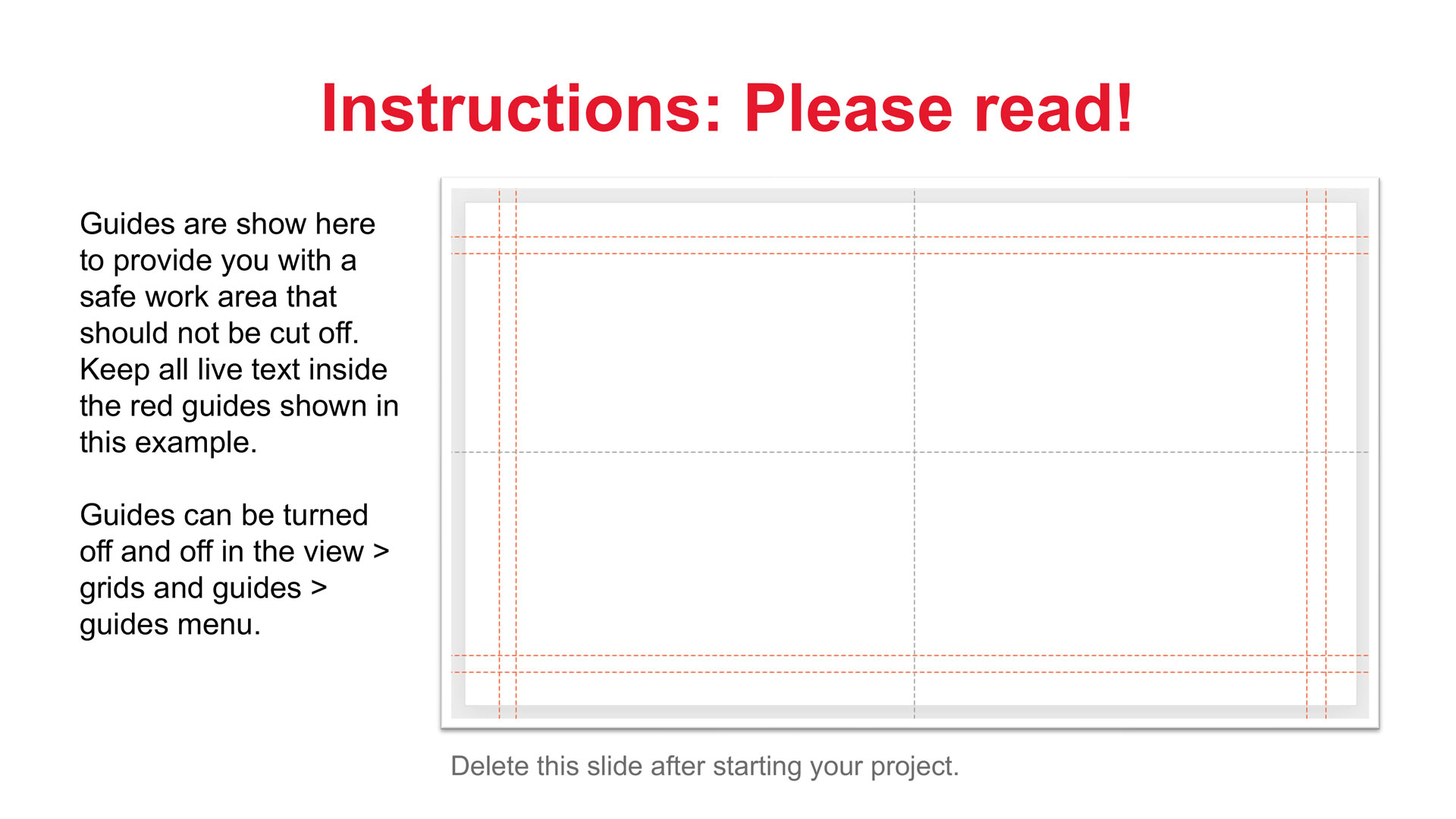
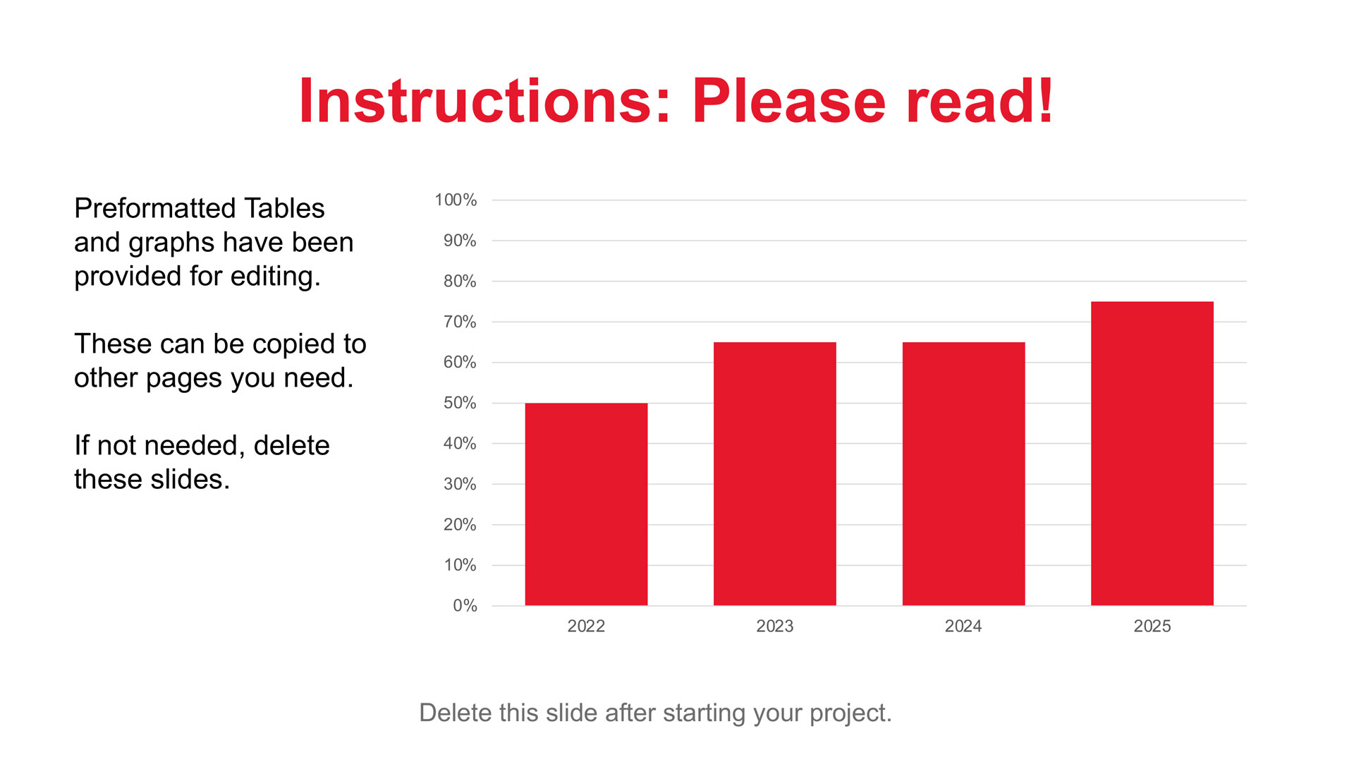
The final deliverable included pre-placed slides with instructions. Rather than just a file, it was an onboarding experience. To make sure the user understands how to approach the template, it begins with some basic university guidelines, including the colors to use and what should or should not be modified. The instructions also include some directions, such as turning on guides, and how working in the “safe zone” of the guides will protect their work.
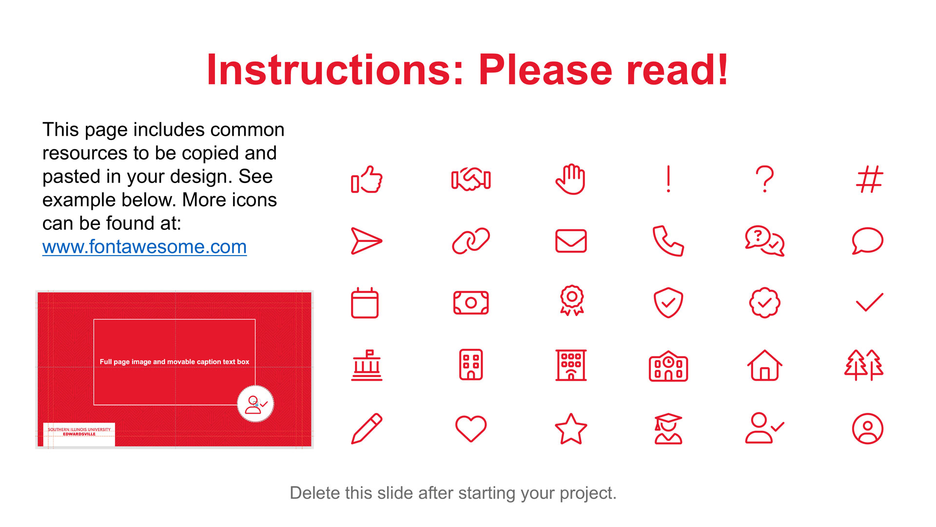
To maintain consistency, I also included the same Font Awesome icon library used on our university website. This ensures a unified tone and prevents users from sourcing off-brand graphics. Placeholder text was also utilized as a real-time training tool, informing the user exactly how to interact with the system. This balance of guidance and flexibility empowers both novice and advanced users to stay within university requirements without feeling restricted.
The Final Reflection
Through this project, I learned that the most effective design systems are those whose scope accounts for the entire user base, not just the artistic vision. I discovered that the ‘users’ we often overlook are the internal staff members tasked with creating content. By solving for their skill gaps, the audience’s experience improves by default.
Moving forward, I view every project through this systemic lens. I see the potential for this ‘self-stewarding’ template approach to translate across other mediums, such as digital signage or one-page marketing flyers, establishing a foundation for design at scale.