Graphic Design
As a graphic designer, I have a diverse range of skills and a strong understanding of production techniques. My work includes typography, publication design, textiles, and branding, and I always consider the culture and potential interactions of my target audience. In addition to my graphic design skills, I am also proficient in illustration, Photoshop, and photography, which allows me to produce my own content and effectively communicate with art teams. My attention to detail and understanding of the power of language and messaging is demonstrated in my use of typography, and my publication designs showcase my ability to create cohesive and visually appealing layouts that enhance the content of the publication. I also have experience creating consistent and effective visual identities for companies and products through branding.
In addition to the design projects featured in my portfolio, you can also visit the Illustration, Photography, Printmaking, and UX sections to see a variety of my other visual design work.
Metro Pulse
Publication Design / Production
Metro Pulse and Knoxville Magazine were two publications under a single publisher in Knoxville, TN. For these publications, I handled various tasks, from managing a staff of designers and artists to weekly cover designs. At the Metro Pulse alt-weekly, I designed the articles and covers and performed copy editing. For Knoxville Magazine I handled production management, article design, and occasional cover design.
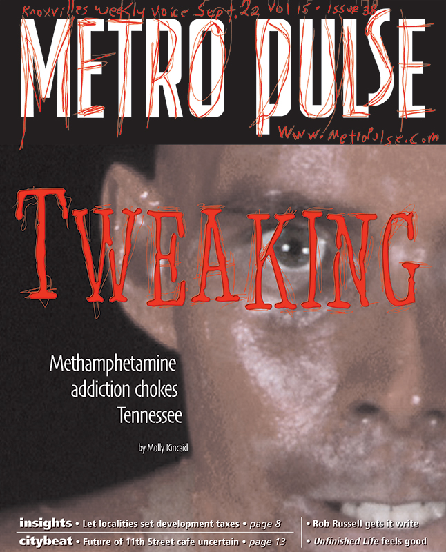
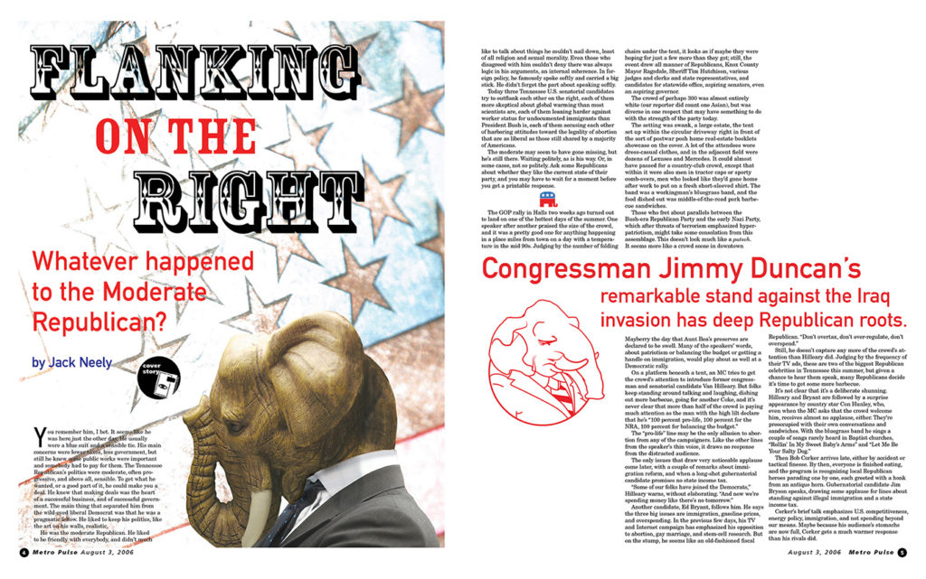
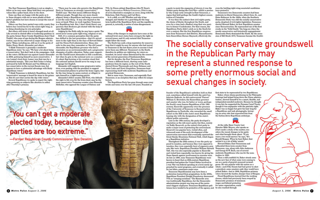
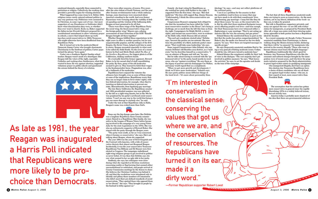
“Flanking on the Right” was a cover story I had done for the Metro Pulse. The article used a combination of full color and spot color. One of the goals was to organize elements in a way so that the spot and full-color-facing pages work together cohesively. The artwork starts with a Photoshop combining an elephant and a human to represent the subject. It is followed by illustrations I made to go with the pull quotes to better break up the body copy. Rather than using a drop cap, I opted to use the elephant logo to denote each smaller section.

Design With Type
Publication Design
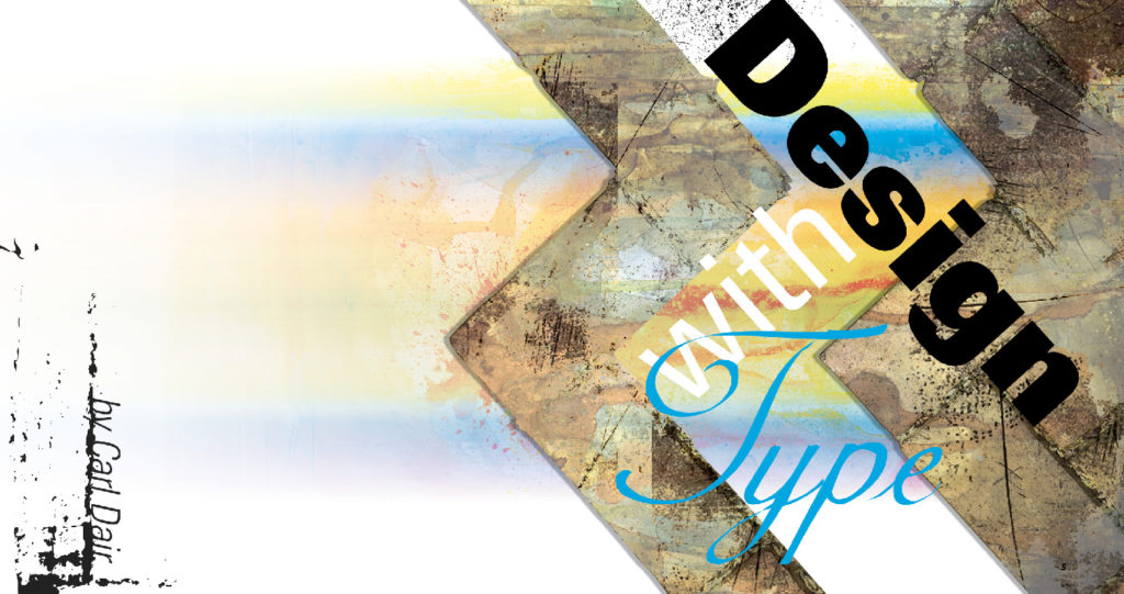
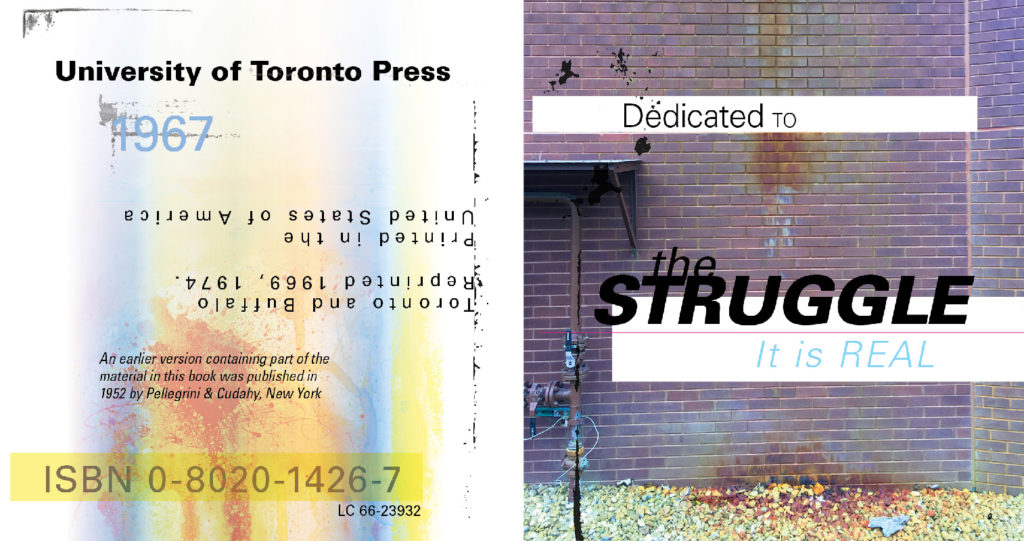
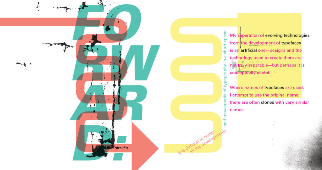
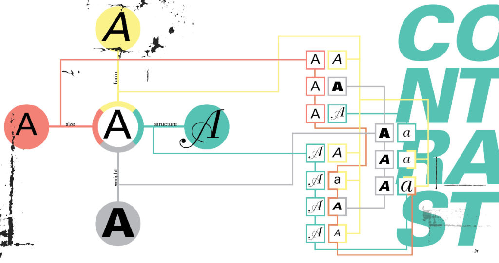
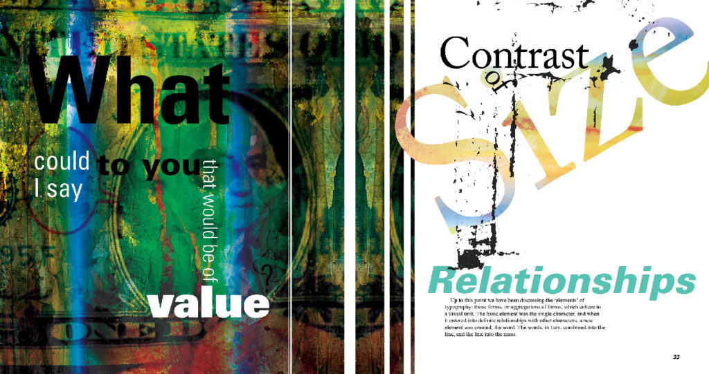
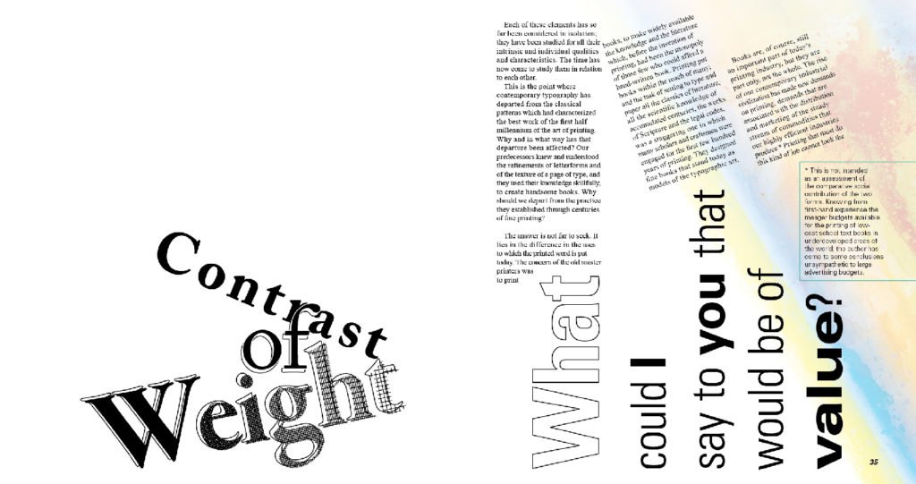
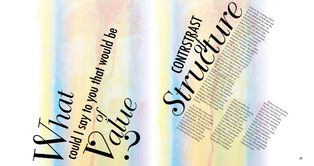
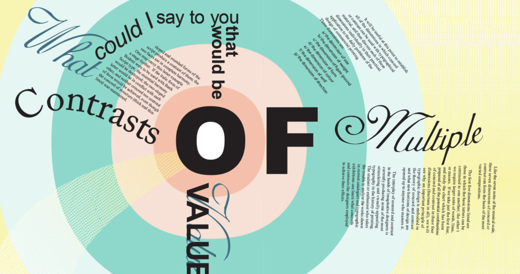
“Design with Type” is a publication that delves into the art and science of typography. Each spread in the book focused on different concepts of typography, exploring the ways in which type can be manipulated to create impactful designs. By incorporating interactive elements directing and guiding the reader, I aimed to engage the audience and encourage them to dive deeper into the content. The sample pages below offer a glimpse into the range of concepts explored in the publication and the creative ways in which type was used to bring them to life.
UTK School of Art
Poster Design
This is a poster for the University of Tennessee’s School of Art. My goal for this piece was to call back to the principles of design taught at this university and the relationship the students have with the ideas of art. Art is more than just a passion. Art and design are also built upon studies of science, culture, and psychology. The idea here is to represent the unison of what this school encourages which is the marriage of heart and mind.

KFO Box Design
Package Design
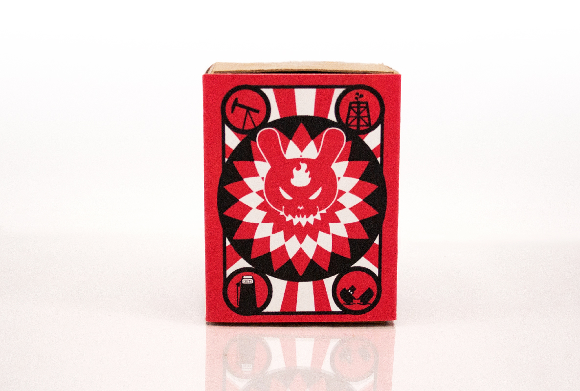
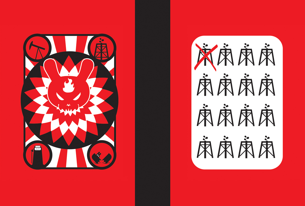
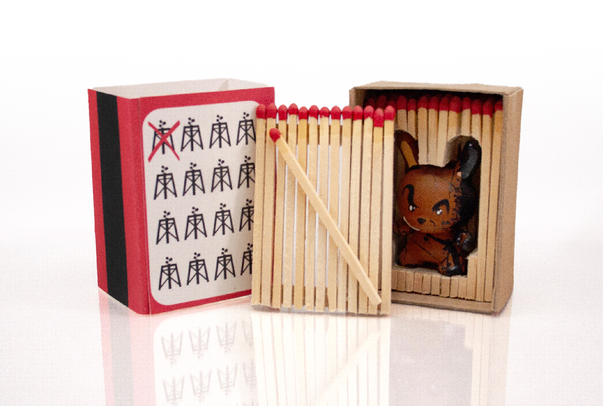
This project involved creating a package for a custom Kidrobot Dunny Art Toy that not only reflected the personality of the character but also added to the experience of opening and revealing the toy inside. The overall design is related to the impact of environmental damages done by some major corporations of the time. The package is designed to resemble a box of matches. As one opens it you are greeted with what appears to be a box of matches. There is one single match affixed to a panel made of matches. The single match being there guides one to select it and as they remove it the whole panel comes with it. This unique design adds to the overall experience of opening the package and discovering the toy inside. Additional images of the custom toy can be found in the custom toy section.
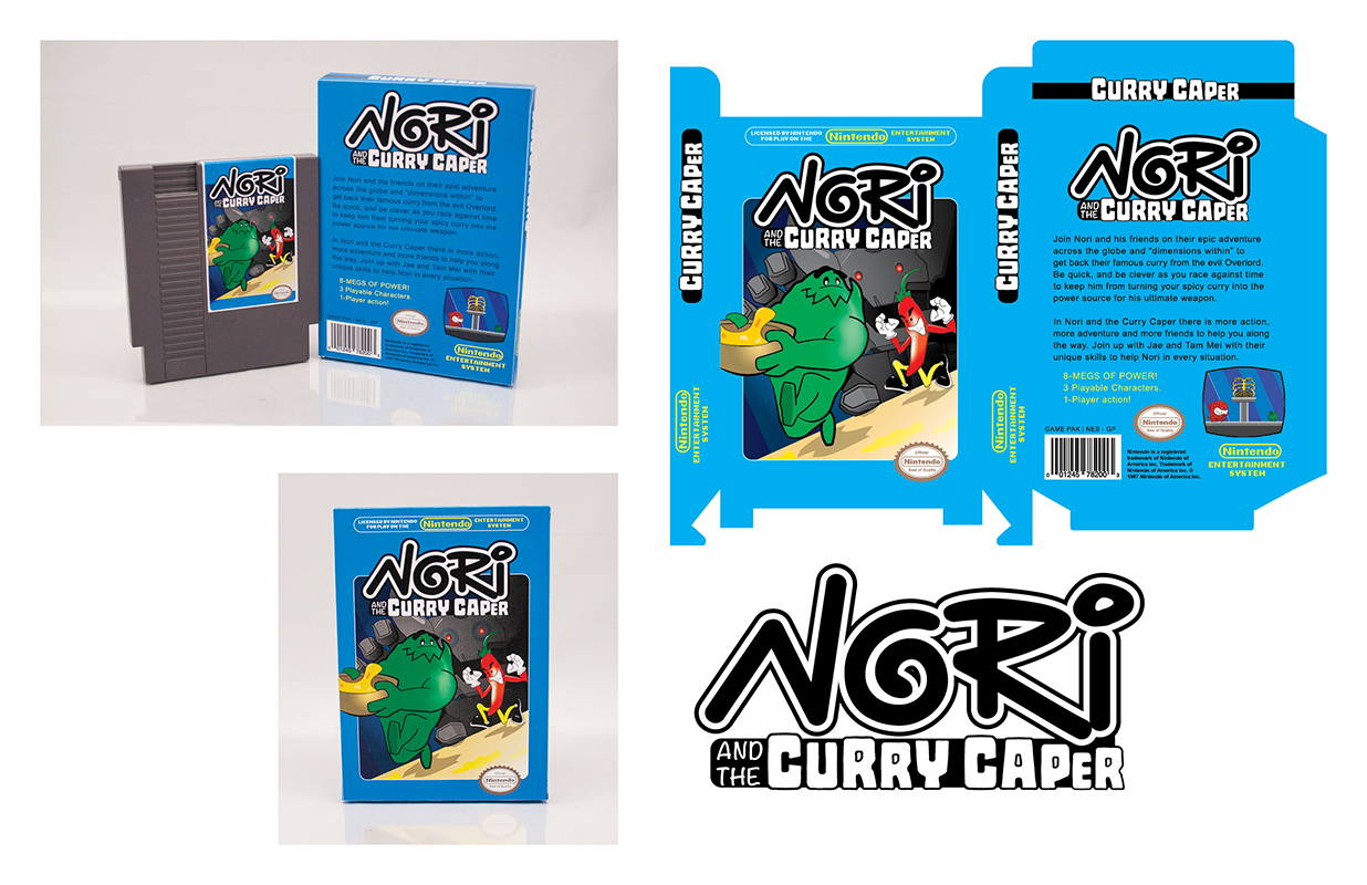
The Curry Caper NES Cartridge
Package Design/ Branding
For this project, I developed a game and created a label and box design that would meet the strict guidelines set by Nintendo in the 1980s. To announce this game I wanted the design to be reminiscent of the era, so I looked to trends of the time to create a package that could pass as an authentic product from that decade. The logo was designed to be playful, and the use of the “O” in “Nori” was intended to evoke a sushi roll, as “Nori” is Japanese for seaweed. Overall, I aimed to create a design that would capture the nostalgia of the 1980s and appeal to fans of classic gaming.
The Curry Caper Arcade
Branding evolution
When I finished the actual game I decided to demo it in an arcade cabinet of my design. I further fleshed out the logo of the title and refined all the designs for a modern product. This included all the elements in-game that unified the project overall. If you would like to read more about the game I designed, you can see it here on my development page.
S.I.E.G.
Branding
For this branding project, I was tasked with developing an identity for a non-profit program focused on being an independent ethics watchdog group for the US government. With the increasing number of leaks coming out of various administrations, I explored the idea of a stool pigeon and used the title to create an acronym that played with the idea of corruption under siege. To visually communicate this concept, I used the feather of the pigeon to resemble fire and designed a pigeon’s head poking out of a window to represent the release of information about any wrongdoing. I chose the colors red, white, and blue to solidify the idea of non-partisanship and to evoke a sense of patriotism that such a group would embody.
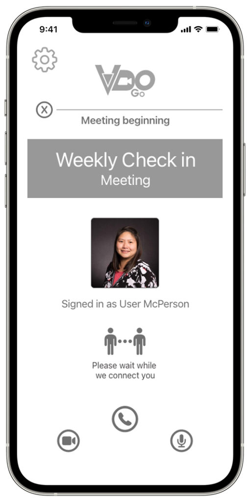
VDO Go
Branding
This branding project was created for a mobile app called VDO Go, which is a new type of video conferencing app. In addition to developing the app itself, I also designed the app’s logo. The logo incorporates elements of video interfaces and iconography to help convey the purpose of the app. The goal was to make the three letters of the app’s name, V-D-O, more easily recognizable as “video” by using accompanying design elements in the logo. You can find more information about the project in the User Experience section.
CowAgator
Branding
Cow-a-Gator is a brand of kid’s clothing that draws inspiration from a child’s imagination, where animals can be combined to create new creatures. The brand’s focus is on its mascot, Cow-a-Gator, as well as other mixed-up animals. The logo is designed to be playful and incorporates elements of both a cow and a gator into the typography. The overall concept is cute and simple, designed to appeal to children and their sense of fun and creativity.
Level 10 Curry House
Branding
The Level 10 Curry House concept is centered around the idea of gamifying the restaurant experience by incorporating challenges and contests. The restaurant offers different levels of spiciness for its curries, with the ultimate challenge being the “Level 10” curry. The logo design features elements of video game bosses to reinforce the idea of a food-eating challenge. The concept also plays into the trend of spicy food challenges and aims to attract customers who are looking for a unique and memorable dining experience.
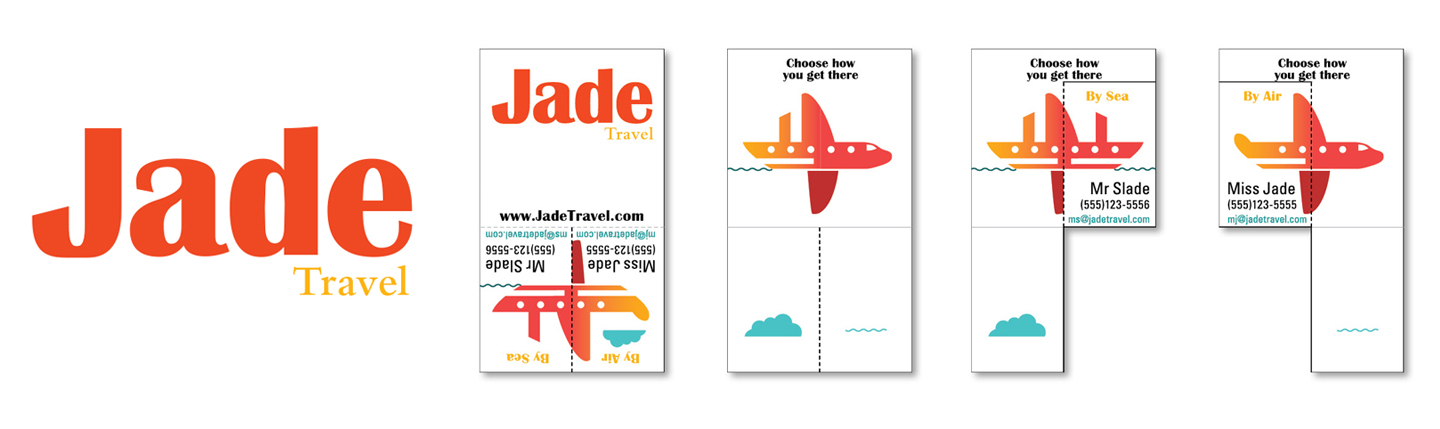
Jade Travel
Branding/ Business Card
The branding project for Jade Travel involved creating interactive media through their business card, in addition to designing the brand identity. The mark itself is simple and elegant, evoking luxury and travel. The main focus was on developing an interactive business card, which led to the creation of transforming shapes that lent itself to this function. The illustration on the card is a hybrid of a ship and an airplane, and the card is partially die-cut and scored in the center, allowing for the ability to fold one of two sections. Using simple iconography, one can fold the side that either represents air or water travel, completing the form of a ship or a plane. The name of the agent who specializes in each type of travel can be joined to the completed image, providing an interactive and engaging experience for the card recipient.
Video Production
Motion Graphics
For video production, I have worn lots of hats. From being in front of the camera to editing and audio I have had some small experience in various roles. I have used iMovie and Final Cut Pro for editing and After Effects in conjunction with Photoshop and Illustrator for adding motion graphics.
These projects are intros for two YouTube channels. Both are made in After Effects and Adobe Illustrator.
- Nori Moving Pictures
- Project CMS